SkyTechSport
Design System
Foundations · Primitives · Components · Sections · Modules · Blog
Typography
Primary: Graphik · Secondary (display/H1): Work Sans
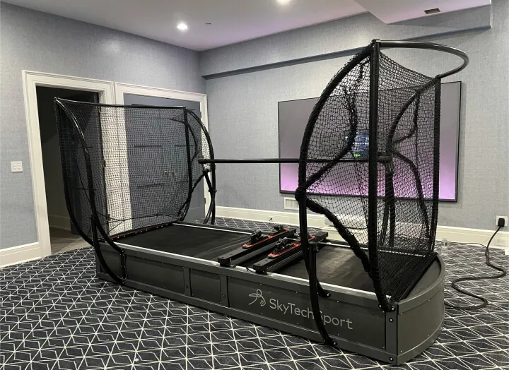
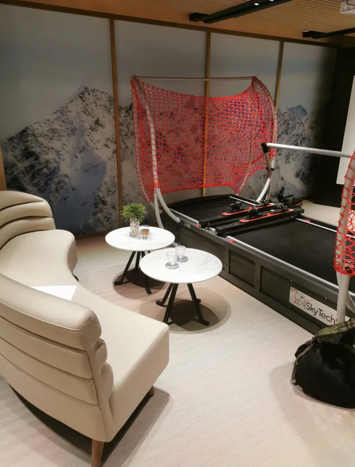
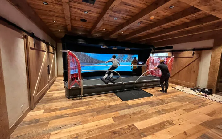
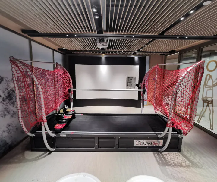
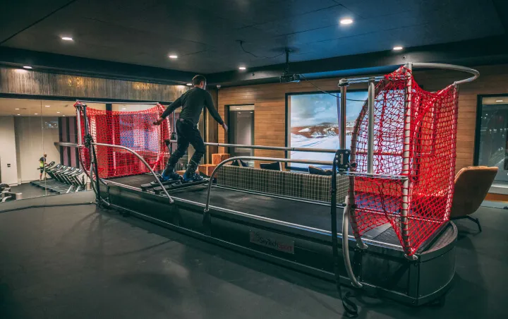
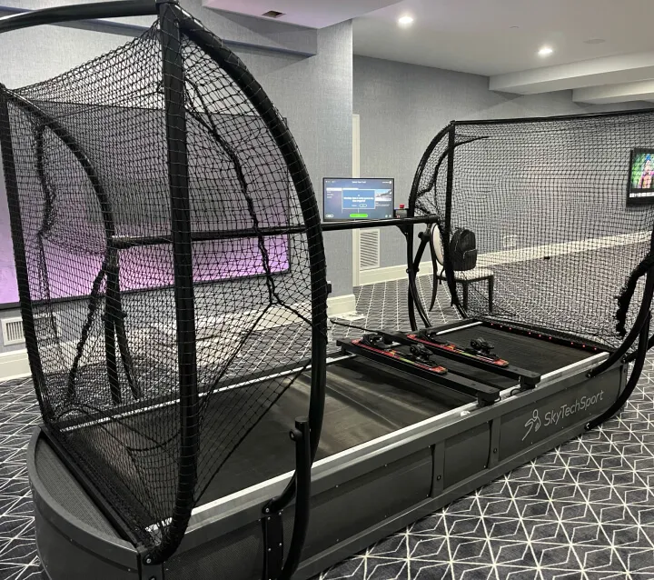
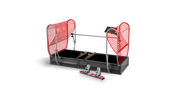
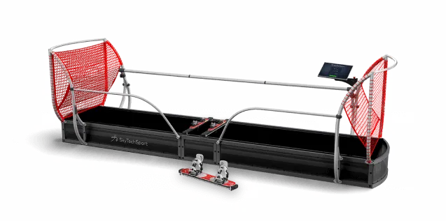
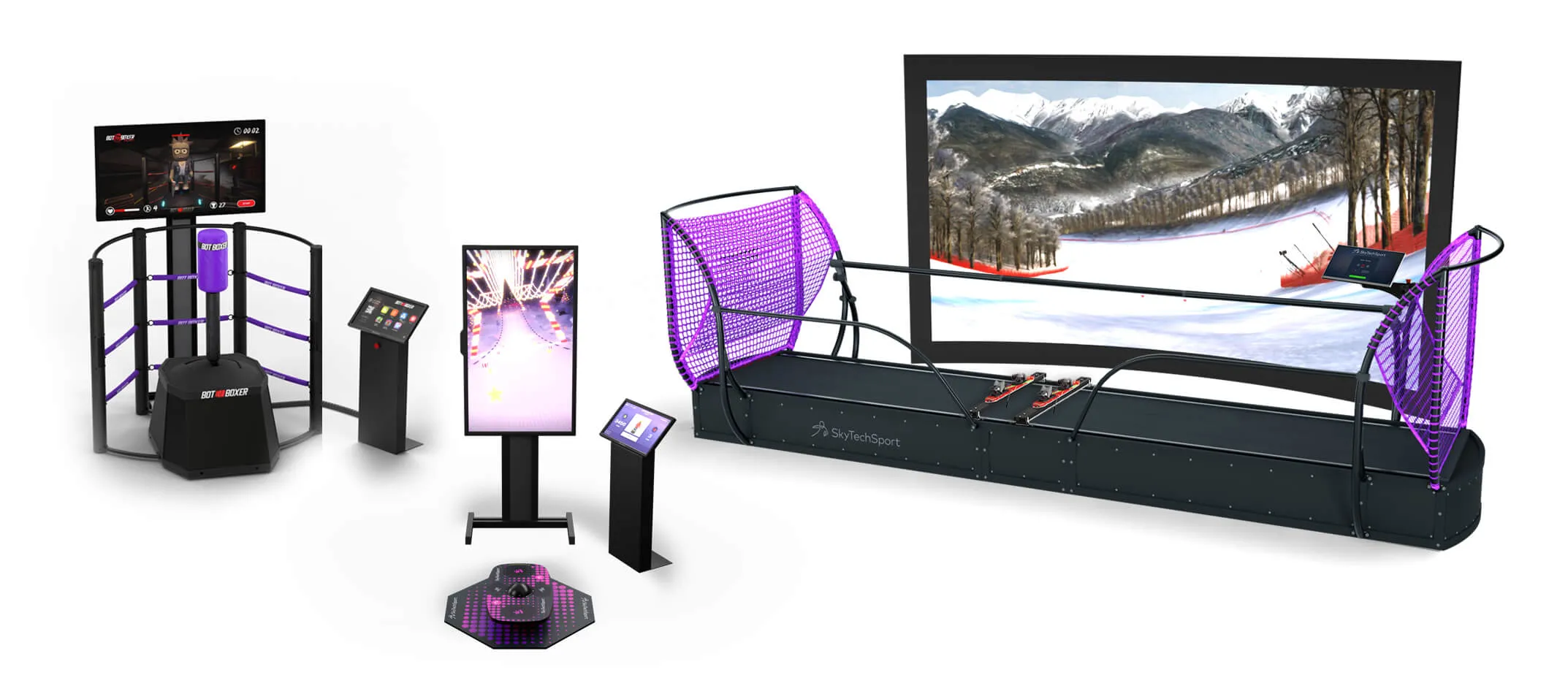
Cutting-Edge Interactive Sports Simulators
Next-Level Training Technology
Experience the Future of Sports Training
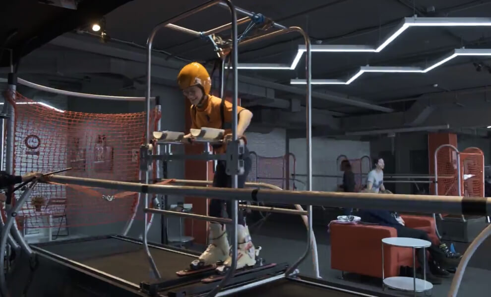
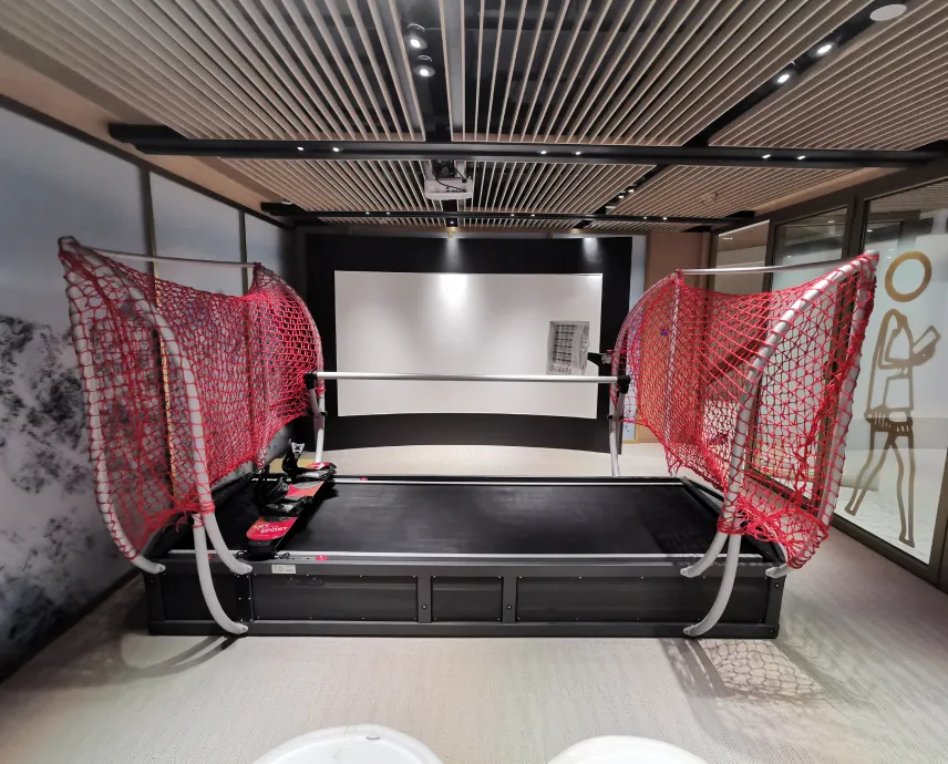
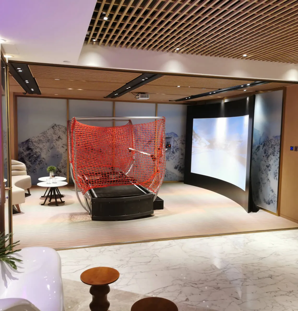
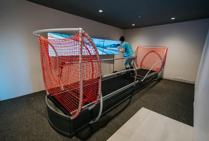
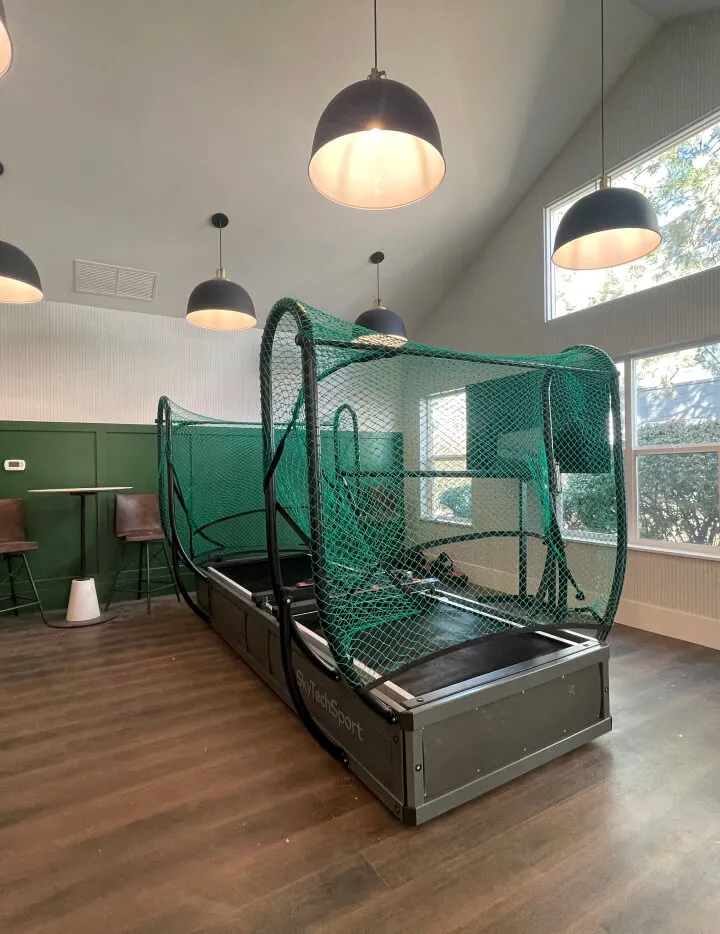
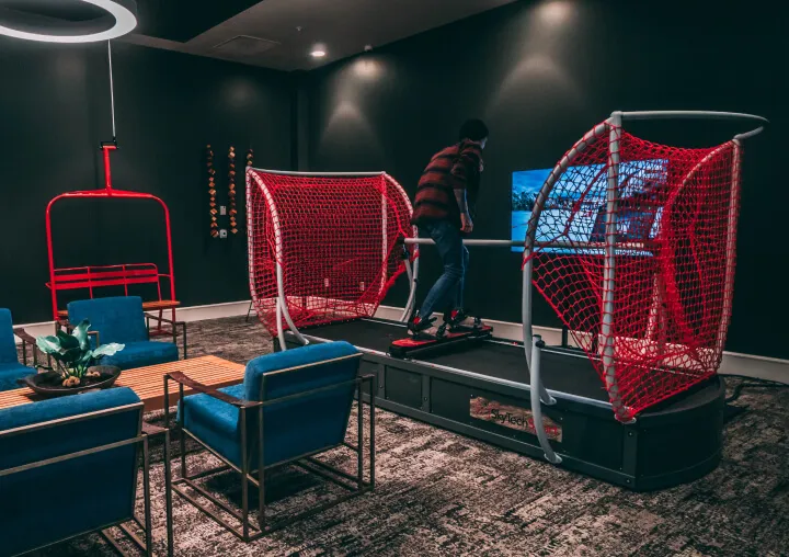
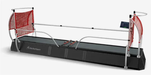
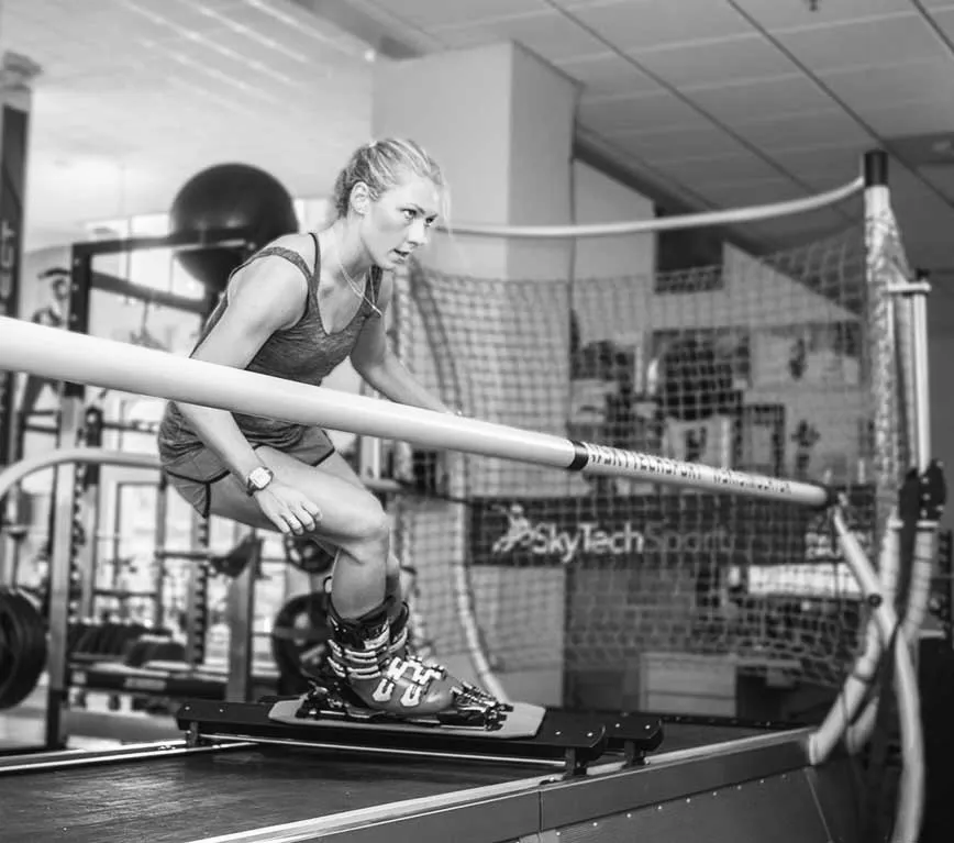
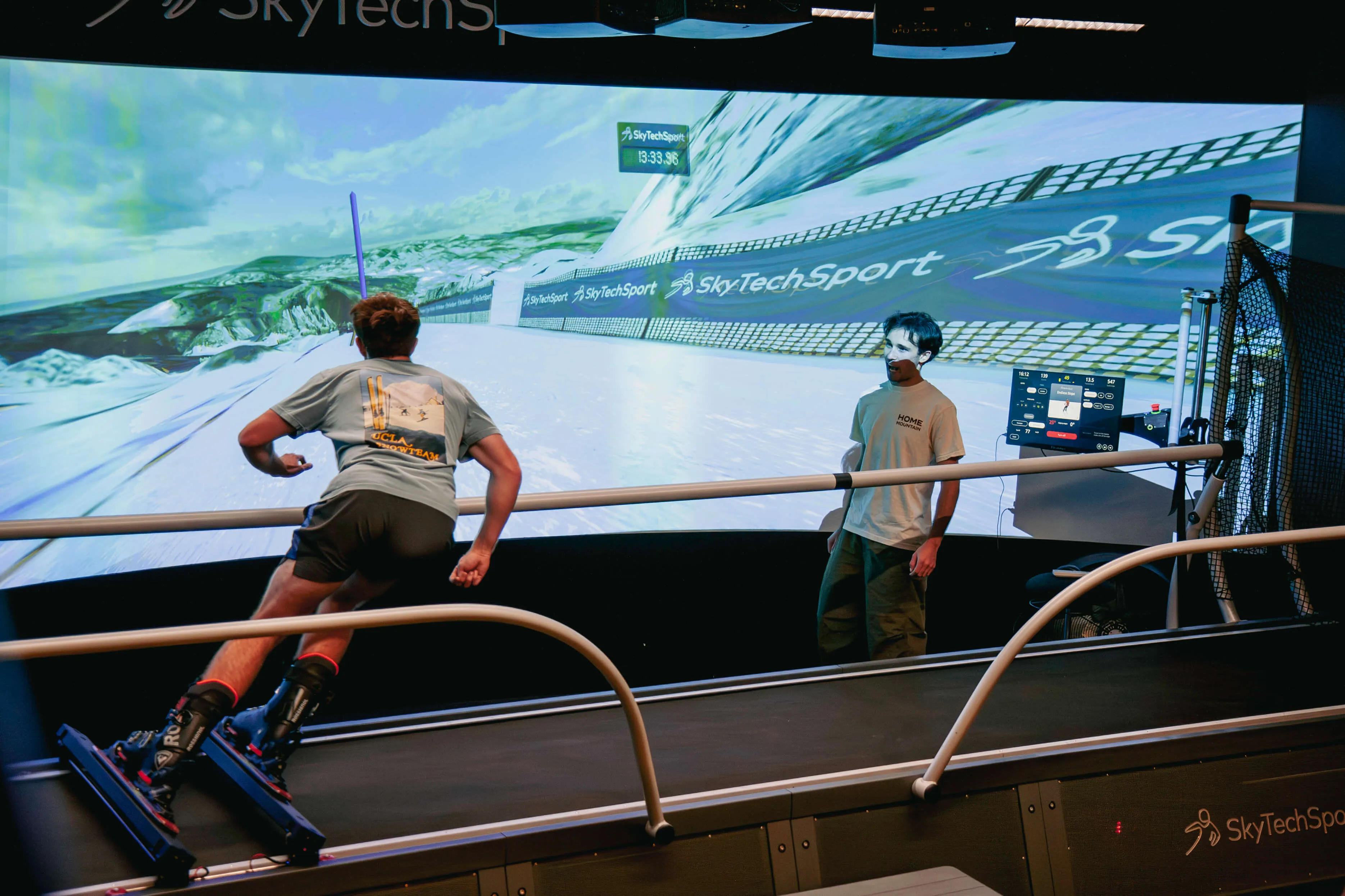
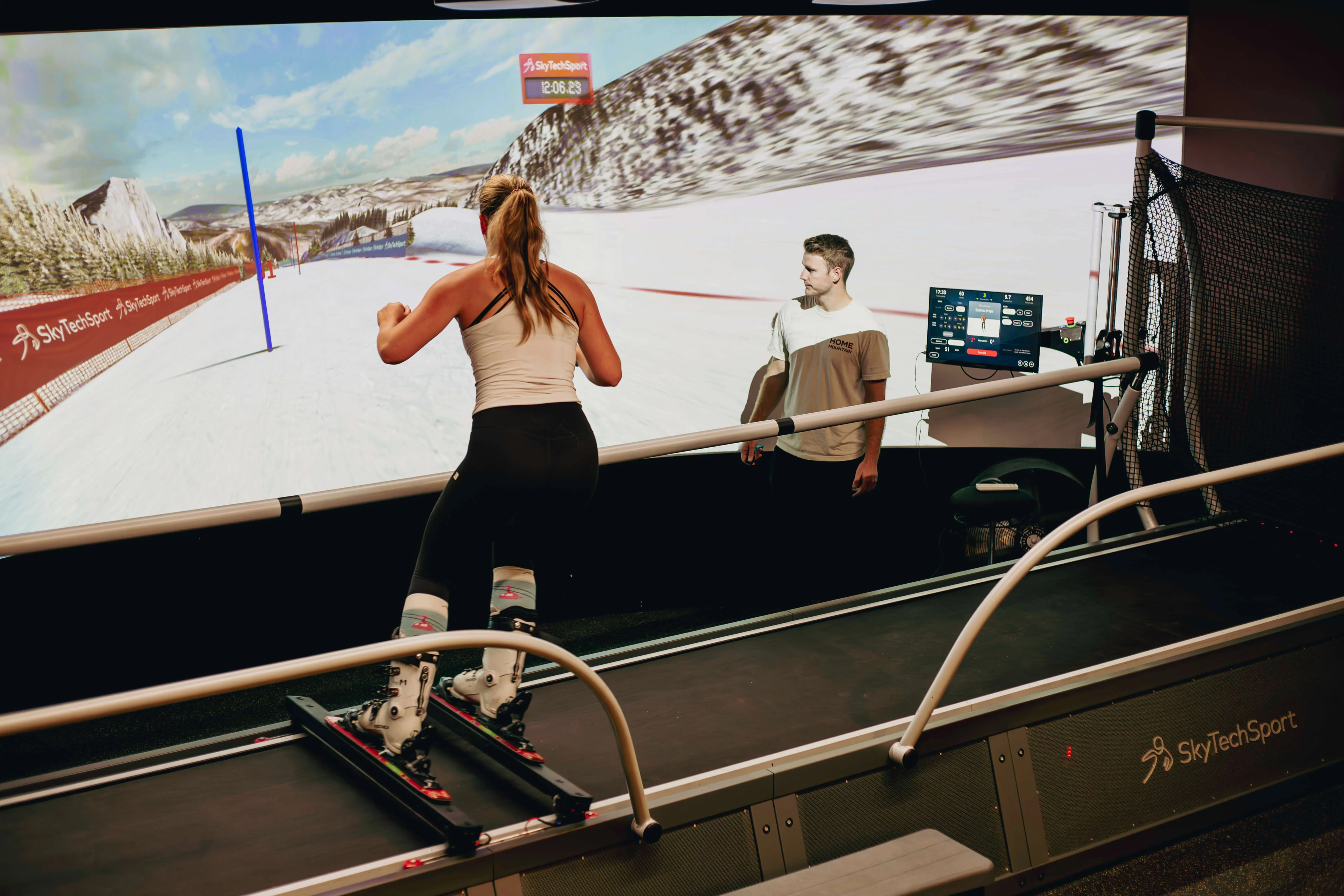
Advanced Snowsports Simulator Technology
Immersive virtual reality integration
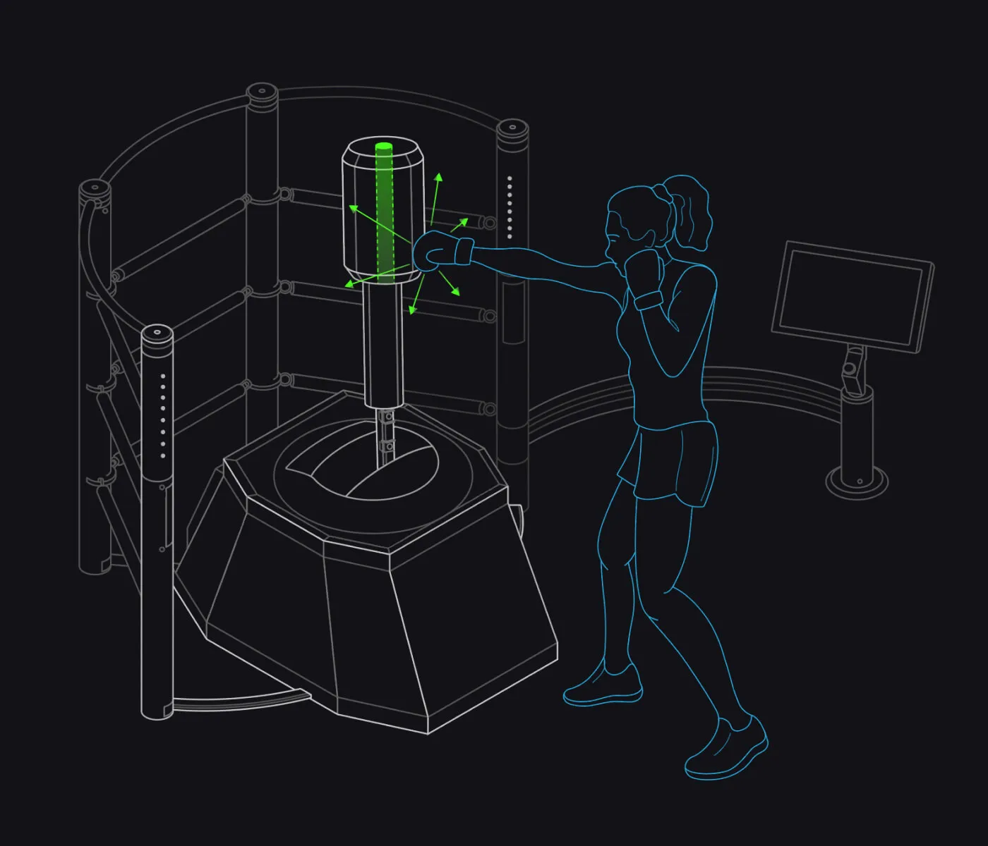
Smart sensors capture your technique while a coach gives instant feedback
body-lg · 20px / 400
We build cutting-edge interactive sports simulators for professional athletes and enthusiasts.
body-md · 18px / 400
We build cutting-edge interactive sports simulators for professional athletes and enthusiasts.
body-base · 16px / 400
We build cutting-edge interactive sports simulators for professional athletes and enthusiasts.
body-sm · 14px / 300
We build cutting-edge interactive sports simulators for professional athletes and enthusiasts.
label-xs · 12px / 500 · CAPS · tracking 0.08em
Feature Highlights
label-sm · 14px / 500
Feature Highlights
label-md · 16px / 500
Feature Highlights
Colors
All tokens from @theme · global.css
accent (Ski)
#ea484d
accent-lime (BotBoxer)
#c6f144
accent-violet (BalancePlay)
#8576ff
accent-orange (SmartHoop)
#ff6c31
dark · gray-850
#17191d
darker · gray-900
#121217
darkest · gray-1000
#0d0d18
red-400
#ea484d
red-500
#c70407
red-600
#a01010
lime-300
#c8ff48
lime-400
#c6f144
lime-500
#79ed74
orange-400
#ff6c31
orange-500
#e85d20
violet-400
#8576ff
violet-500
#6d5aff
carmine
#ff3062
50
#f9f9f9
100
#f5f5f5
200
#f3f3f3
300
#ebebeb
400
#b1b1b1
500
#7e7e7e
600
#424242
650
#36373a
700
#2a2c32
750
#23252a
800
#1e2024
850
#17191d
900
#121217
950
#141418
1000
#0d0d18
Product Themes
CSS class on body overrides --color-accent for all descendant components
.theme-ski
Ski Simulators
#ea484d
.theme-botboxer
BotBoxer
#c6f144
.theme-balanceplay
BalancePlay Pro
#8576ff
.theme-smarthoop
SmartHoop
#ff6c31
Breakpoints
Tailwind v4 custom breakpoints from global.css @theme
| Token | Width | Prefix | Usage |
|---|---|---|---|
| --breakpoint-sm | 480px | sm: | Mobile landscape → small tablets |
| --breakpoint-md | 768px | md: | Tablets, 2-column grids kick in |
| --breakpoint-lg | 992px | lg: | Desktop — sidebar shows, 3-col grids, nav unfolds |
| --breakpoint-xl | 1280px | xl: | Wide desktop |
| --breakpoint-2xl | 1440px | 2xl: | Design-width — max-w containers hit cap |
| --breakpoint-3xl | 2561px | 3xl: | Ultra-wide — heading scale-up for large displays |
Visual scale
Page Layout
Page assembly rules: anatomy, containers, spacing
Page anatomy
BaseLayout → <header slot> → <main> sections </main> → <footer slot>
Container widths
| Container | max-width | Where used |
|---|---|---|
| max-w-[1440px] | 1440px | Content sections, Header nav, CardGrid, SplitSection, etc. |
| max-w-[1366px] | 1366px | Footer (all sub-containers) |
| max-w-[900px] | 900px | TextSection (prose), legal pages, blog posts |
| max-w-[700px] | 700px | CTA blocks, centered narrow content |
| full-bleed | 100% | Hero sections, dark-bg sections, FullImage |
Horizontal padding scale
| Breakpoint | Tailwind class | Value | Note |
|---|---|---|---|
| base | px-6 | 24px | Mobile — all sections |
| lg: | lg:px-10 | 40px | Desktop — most content sections |
| lg: | lg:px-20 | 80px | Desktop — Header, Footer, wide pages |
Pattern: max-w-[1440px] mx-auto px-6 lg:px-10 — standard section container
Section vertical spacing
| Context | Class | Value |
|---|---|---|
| Content sections (standard) | py-16 lg:py-24 | 64px → 96px |
| Hero sections | py-20 | 80px (+ min-height) |
| Compact sections | py-12 lg:py-16 | 48px → 64px |
| Footer sub-sections | py-5 / py-8 | 20px / 32px |
Sandbox: real page assembly (Header + sections + Footer) for responsive testing
Spacing
Base unit — 4px
2xs
8px
xs
12px
sm
20px
md
40px
lg
60px
xl
80px
2xl
100px
3xl
140px
| Props | |
|---|---|
| href (required) | Link target URL |
| label (required) | Link text |
| external? | Opens in new tab (target="_blank" rel="noopener") |
| size? | "base" (16px, default) or "sm" (14px) |
| class? | Color+hover classes from parent (e.g. "text-white hover:text-white/60") |
| Visual | |
| Arrow icon | Always text-accent, 20×20 SVG, flex-shrink-0 |
| Layout | inline-flex items-center gap-2.5 |
| Transition | transition-colors on the anchor |
| Usage | |
| SplitSection | CTA array, color from theme (dark → white, light → black) |
| HeroVideo | CTA array, "text-white hover:text-white/80" |
| AppDownload | iOS/Android links, external |
| ContactForm | "Book A Meeting" CTA, external size="sm" |
| Props | |
|---|---|
| label (required) | Button text |
| href? | Renders as <a> when provided, <button> otherwise |
| variant? | "filled" (default), "outlined", "ghost" |
| size? | "sm" (px-4 py-2), "md" (default, px-6 py-3), "lg" (px-8 py-4) |
| fullWidth? | Adds w-full (form submits) |
| external? | Opens in new tab |
| type? | "button" (default) or "submit" |
| class? | Color override (replaces default palette per variant) |
| Default colors per variant | |
| filled | bg-accent text-white hover:bg-accent/90 |
| outlined | bg-white border border-black text-black hover:bg-gray-50 |
| ghost | bg-transparent border border-white/50 text-white hover:bg-white/10 |
| Usage | |
| ProductGrid | filled (default) for "Build Your Own" CTA |
| SlopeShowcase | filled for slope CTA |
| DemoLocationCard | outlined (primary) + filled (secondary), fullWidth |
| VirtualDemoCard | ghost with white border, fullWidth |
| ConfiguratorCTA | filled, size="lg" |
| VideoCTA | filled, size varies by variant |
| PromoBanner | filled with ctaColor override (lime/accent/white) |
| RevenueCalculator | ghost (default white border) |
| NotifyMeForm | filled, fullWidth, type="submit" |
Filled (default)
Book a DemoOutlined
Request a Product DemoOutlined · accent color
Learn MoreFull-width
Filled (default)
Book a DemoGhost
Book a Virtual CallGhost (border-white/80)
Book a Virtual CallFilled white
Get Started| Props | |
|---|---|
| class? | Tailwind size/color classes. Default w-4 h-4 |
| Behavior | |
| Color | Inherits currentColor from parent |
| Accessibility | aria-hidden="true" (decorative) |
Used in VirtualDemoCard checklist items.
| Props | |
|---|---|
| direction? | "right" | "left" | "down" | "up". Default "right" |
| class? | Tailwind size/color classes. Default w-4 h-4 |
| Behavior | |
| Color | Inherits currentColor via fill |
| Rotation | CSS rotate-90 / rotate-180 / -rotate-90 |
| Accessibility | aria-hidden="true" (decorative) |
Used in InfoBanner, CardGrid, Testimonials (prev/next arrows + "Learn more" links).
| Props | |
|---|---|
| fixedNav? | Boolean. Default true — sticky on scroll |
| overlay? | Boolean. Default false — transparent over hero, switches to solid dark on scroll |
| Layout | |
| Top banner (lg+) | bg-[rgb(7,7,7)] h-10 — phone/email + social icons |
| Main navbar | absolute z-[1000] — transitions to fixed on scroll via JS |
| Logo | Dark on light bg, white on dark/overlay |
| Nav items | |
| Snowsports Simulator | Dropdown: Home / Business |
| BotBoxer | Dropdown: Home / Business |
| BalancePlay Pro | Direct link with green badge |
| Smart Hoop | Direct link |
| More | Dropdown: Contact / About / Blog / Grant Program / Rentals / Custom Software / Owner's Guides |
| Behavior | |
| Overlay mode | On scroll > 50px: switches to solid dark bg + white logo |
| Mobile | Hamburger menu, slide-down panel with nested dropdowns |
Normally used via <Header slot="header" /> in BaseLayout. The overlay prop is true on homepage only; all other pages use solid dark. Live demo below renders inside a contained wrapper.

| Sections (top to bottom) | |
|---|---|
| Apps section | bg-[rgb(43,46,52)] — iOS/Android download buttons |
| Link columns | 3 columns: Products / Services / Resources, max-w-1366px |
| Contact | "Los Angeles, California" + address + phone |
| Copyright | bg-[rgb(42,44,50)] — year + name |
| Background colors | |
| Main bg | bg-[rgb(35,37,42)] |
| Apps section | bg-[rgb(43,46,52)] (slightly lighter for visual separation) |
| Copyright | bg-[rgb(42,44,50)] |
| Typography | |
| Column headings | 14px / 400 / rgb(129,129,129) (gray-500) |
| Links | 14px / 400 / rgb(167,167,167) |
| Contact city | 20px / 400 / white |
| Contact address | 14px / 300 / white |
Normally used via <Footer slot="footer" /> in BaseLayout. No props.
| Props | |
|---|---|
| text (required) | Heading content |
| subtitle? | Lead paragraph below heading (max-w-4xl, mt-6) |
| variant? | "black" (default) · "white" (on dark/video bg) · "accent" |
| arrow? | Show arrow-down-big.svg icon above (48px, mb-2, pt-10 on heading) |
| as? | "h1" | "h2" | "h3" (default h2) |
| align? | "center" (default) · "left" |
| Typography Scale | |
| Mobile (< 992) | 34px / 40px, font-normal (400) |
| lg (992+) | 56px / 62px, font-light (300) |
| 3xl (2561+) | 84px / 93px |
| Font | Graphik (primary), tracking-[-0.02em] (inherited from base h2) |
| Subtitle Style | |
| Size | text-base (16px) → md:text-lg (18px) |
| Weight / line-height | font-normal leading-[1.6] |
| Width | max-w-4xl (56rem / 896px) |
| Spacing | mt-6 (24px) below heading |
| Arrow Icon | |
| Size | w-12 h-auto (48px wide — native SVG size) |
| Spacing | mx-auto mb-2 (8px below arrow), heading gets pt-10 (40px above text) |
| Section padding | When arrow + section: top padding reduced to pt-1 (arrow sits near previous section) |
Reusable across index.astro, ski-simulators-home.astro, ski-simulators-business.astro. The wrapping <section> controls outer padding/margin; this component only handles the heading + optional subtitle block.
Our Products
Demo Interactive Sports Simulators
We offer in-person demos at our showroom in Los Angeles or request a virtual demo to learn about our sports simulators from anywhere.
SkyTechSport Plus Subscription
World-Class Ski Slopes at Home
| Props | |
|---|---|
| variant? | "light" (default) · "accent" · "white" · "dark" |
| icon? | Image path. Auto-inverts to white on accent/dark variants |
| iconAlt? | Alt text for icon |
| heading? | Card heading. Use \n for line breaks |
| align? | "center" (default) · "left" |
| class? | Additional CSS classes on outer div |
| <slot /> | Free-form content: buttons, checklist, form, text — anything |
| Card Shell | |
| Border radius | rounded-3xl (24px) |
| Padding | p-4 lg:p-5 xl:p-8 |
| Layout | flex flex-col |
| Variant backgrounds | |
| light | bg-gray-100 + text-black heading |
| accent | bg-accent + text-white heading + icon auto-invert |
| white | bg-white + text-black heading |
| dark | bg-dark + text-white heading + icon auto-invert |
| Icon (optional) | |
| Size | w-full h-48 object-contain mb-6 |
| Invert | brightness-0 invert auto-applied on accent/dark |
| Composition patterns | |
| Action card | icon + heading + tagline + 1–2 Buttons + footnote (replaces DemoLocationCard) |
| Feature card | icon + heading + lead + checklist + ghost Button (replaces VirtualDemoCard) |
| Form card | heading + body + form fields + submit Button (replaces NotifyMeForm) |
Card is the base shell. Specific card types (DemoLocationCard, VirtualDemoCard, NotifyMeForm) will migrate to Card + slot content. The variant + slot pattern keeps the shell consistent while allowing arbitrary inner content.

Demo in
Los Angeles, CA
Feel the slope at our LA showroom
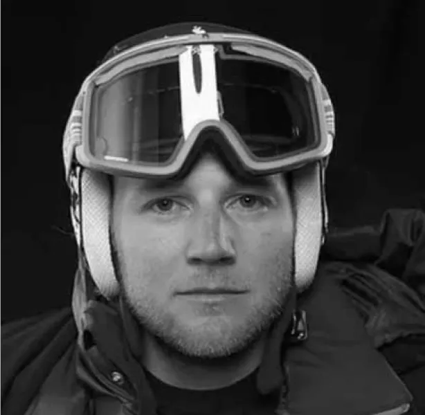
Smart sensors capture your technique while a coach gives instant feedback.

Virtual Demo
Book a 1-on-1 demo with a product expert
No Sports Simulators In Your City Yet?
Notify me when the SkyTechSport simulator in my area becomes available!
Light
bg-gray-100
Accent
bg-accent
White
bg-white
Dark
bg-dark
| Props | |
|---|---|
| href (required) | Link target (typically checkout/store) |
| image (required) | Product image (object-contain, fitted to fixed-width area) |
| imageAlt (required) | Alt text |
| storeLabel? | "Store" SVG label above title (default img_store_lable.svg) |
| title (required) | Card title (e.g. "Ready-made Sets") |
| subtitle (required) | Card subtitle (e.g. "Go to Store") |
| Layout | |
| Element | <a> with class .store-card |
| Layout | flex items-center bg-white |
| Border | rounded-xl border-2 border-transparent transition-colors |
| Hover | border-color: var(--color-accent) — theme-aware (red/lime/violet/orange) |
| Image Area | |
| Mobile | 173x88px |
| md+ | 216x110px |
| Image fit | w-full h-full object-contain mix-blend-multiply (drops white background) |
| Text Area | |
| Padding | px-5 py-4 |
| Store label | h-5 mb-2 (auto width SVG) |
| Title | text-base font-medium text-gray-800 |
| Subtitle | text-sm text-gray-500 |
Used inside SplitSection as a "buy directly" shortcut. Hover border auto-picks the accent color of the parent product theme via var(--color-accent).
| Props | |
|---|---|
| backgroundImage (required) | Background image URL |
| gradientOverlay? | CSS gradient string applied on top of image (multiple comma-separated) |
| heading (required) | Section heading |
| paragraphs (required) | Array of { text, variant? }. Variant: "body" (default) or "emphasis" |
| size? | "default" · "large" (more padding on lg+) |
| as? | Heading element h1 | h2 | h3 (default h2) |
| textColor? | "white" (default) · "black" |
| Layout | |
| Container | max-w-[1440px] mx-auto flex flex-col gap-5 lg:gap-8 |
| Padding (default) | py-12 px-6 lg:py-20 lg:px-10 |
| Padding (large) | py-20 px-6 lg:py-[140px] lg:px-[60px] |
| Background | |
| Composition | Gradient overlay layer(s) + image, both via background-image |
| Sizing | background-size: cover; background-position: center |
| Heading Typography | |
| Mobile | 34/40 px, font-normal |
| md (768+) | 36/44 px |
| lg (992+) | 48/56 px, font-light |
| 2xl (1440+) | 54/62 px |
| Body Paragraph (variant="body") | |
| Style | text-base md:text-lg leading-relaxed lg:max-w-[50vw] |
| Emphasis Paragraph (variant="emphasis") | |
| Mobile | 30/36 px, font-light |
| md (768+) | 28/36 px |
| lg (992+) | 36/44 px |
| 2xl (1440+) | 40/50 px |
| Width | lg:max-w-[70%] |
Used on ski-simulators-home.astro ("365 Days of Skiing"). Pattern fits any branded narrative section with photographic backing — emphasis paragraph creates visual rhythm between regular body lines.
365 Days of Skiing
You love the thrill, the competition, and the challenge of skiing, but busy schedules and the offseason get in the way.
The world's ONLY snowsports simulator proves that time and space are no obstacles to becoming the best ATHLETE you can be.
The SkyTechSport ski & snowboard simulator used to only be available to pro athletes. Now you too can learn and train from anywhere, getting the same adrenaline rush.
Reshaping the Way We Learn & Train
SkyTechSport was founded by die-hard snowsports fans in response to mother nature's stubborn refusal to accommodate skiers everywhere at all times.
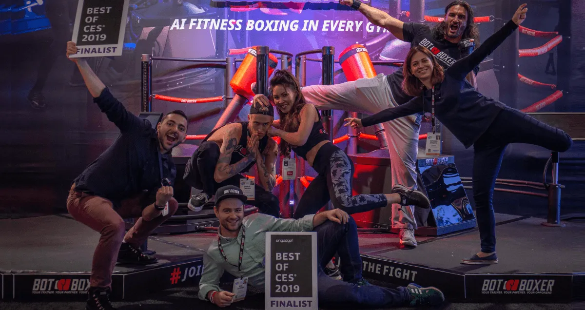
A good boxing gym is not always next door. That is why we created BotBoxer – a robotic punching bag.
Cutting-Edge Interactive Sports Simulators
Technology that's built to achieve extraordinary heights.
Bring the Mountains Closer to Home
| Props | |
|---|---|
| heading (required) | Section heading (h2) |
| heroImage (required) | Large hero photo with diagonal gradient overlay |
| heroImageAlt? | Optional ARIA label |
| heroText (required) | Text overlaid bottom-left of hero photo |
| cards (required) | Array of { image, imageAlt, text } — 2 supporting cards |
| background? | Tailwind bg class. Default bg-[#303237] |
| Layout | |
| Section padding | py-[60px] pb-[80px] px-6 lg:px-[60px] |
| Container | max-w-[1440px] mx-auto |
| Heading | text-white mb-6 (base h2 from global) |
| Hero Photo Block | |
| Height | h-[60vh] |
| Border radius | rounded-xl + mb-[40px] |
| Text alignment | flex flex-col justify-end pb-[60px] px-6 lg:px-[60px] |
| Overlay | Diagonal: linear-gradient(217deg, transparent, #000) |
| Overlay text | text-base font-light text-white max-w-lg leading-relaxed |
| Cards Row | |
| Layout | flex flex-col md:flex-row gap-[30px] |
| Card shell | bg-white rounded-xl overflow-hidden flex-1 |
| Card image | w-full h-[300px] object-cover |
| Card text | p-5 + text-sm text-gray-700 leading-relaxed |
Used on ski-simulators-home.astro for "Skiing With No Limits" (adaptive accessibility section). Pattern: branded value statement + supporting evidence cards.
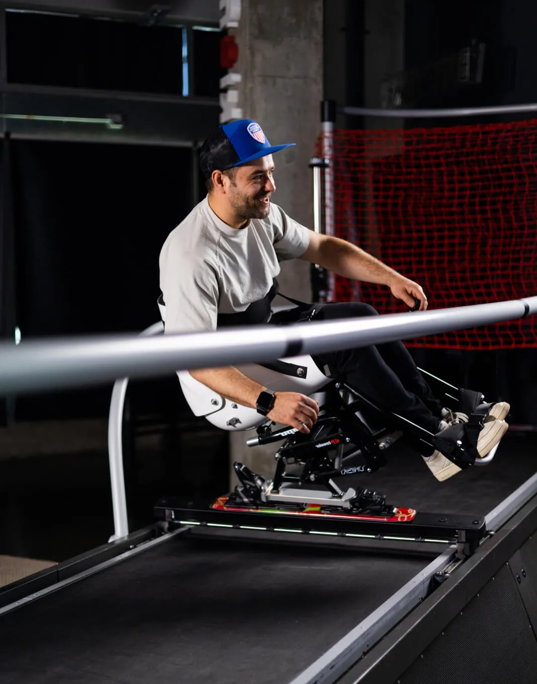
Skiing With No Limits
With specialized adaptive platforms, our ski and snowboard simulator can bring the joy of real skiing to all sports lovers.
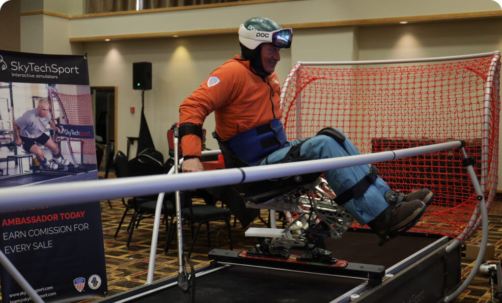
Tested in cooperation with U.S. Ski and Snowboard Association our simulators break boundaries and limitations.
Add an adaptive ski platform within seconds and share the joy of speeding down the slope with everyone.
| Props | |
|---|---|
| image (required) | Full-width hero photo |
| imageAlt (required) | Alt text |
| caption (required) | Small caption (athlete name + titles) |
| quote (required) | Quote text (rendered as h3) |
| logo (required) | Endorsement logo image |
| logoAlt (required) | Logo alt |
| background? | Tailwind bg class. Default bg-[#23252a] |
| Layout | |
| Photo | w-full h-auto (full-width, intrinsic height) |
| Caption row | text-center px-6 py-4 |
| Quote row | flex flex-row justify-center items-center gap-10 pt-5 pb-[60px] |
| Quote padding | px-5 lg:pl-5 lg:pr-[60px] |
| Caption | |
| Style | text-sm text-gray-400 |
| Quote (h3) | |
| Style | text-xl lg:text-2xl font-light text-white text-right max-w-lg |
| Logo | |
| Size | w-[20%] max-w-[231px] object-contain flex-shrink-0 |
Used on ski-simulators-home.astro for the Mikaela Shiffrin × U.S. Ski Team endorsement. Reusable for any "athlete-of-the-page" testimonial pattern.
Mikaela Shiffrin, two-time Olympic gold medalist, and three-time Overall World Cup champion
The only snowsports simulator in the world trusted by the U.S. Ski & Snowboard Team.
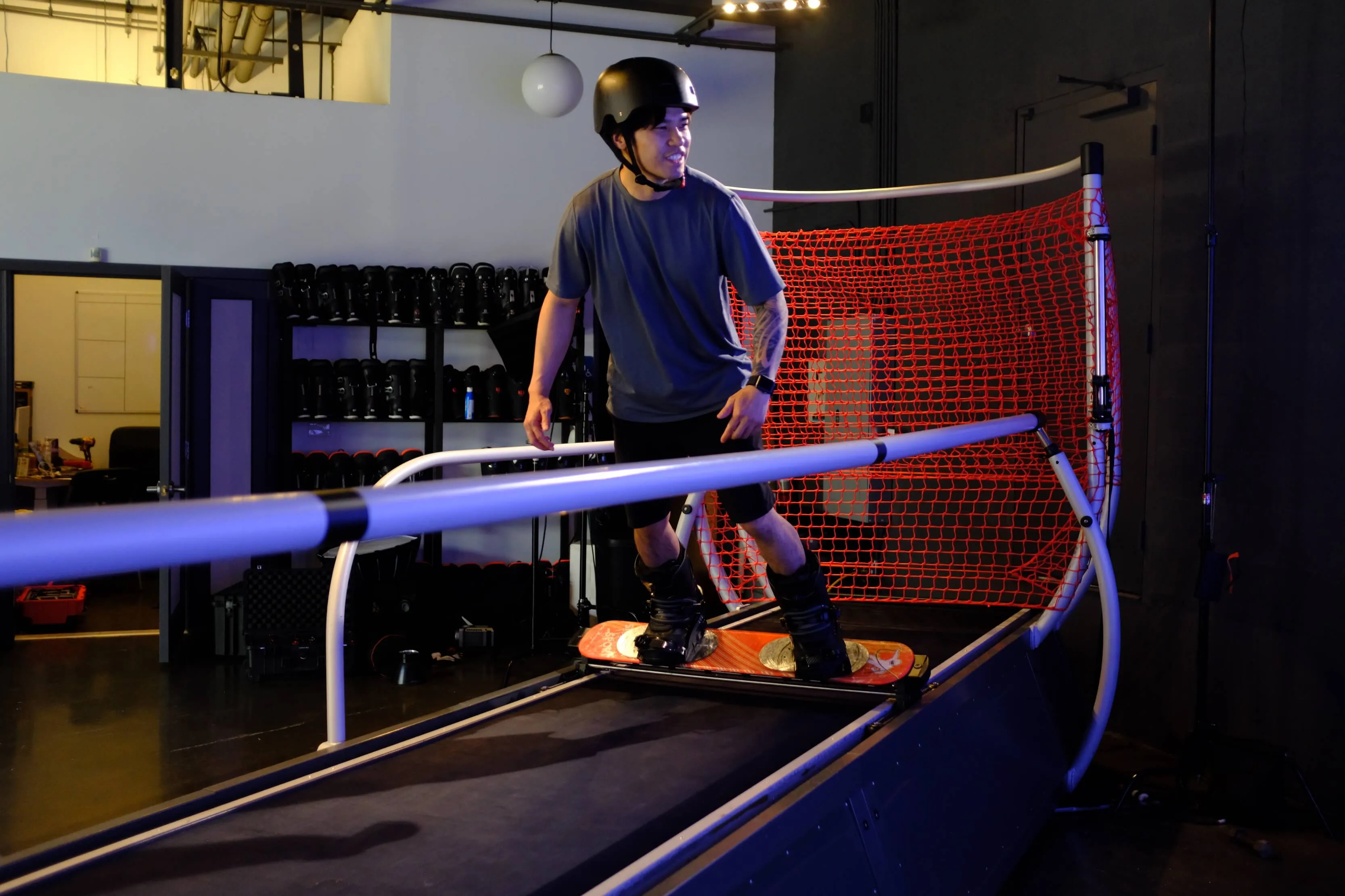
Ski And Snowboard Simulators
Your personal ski slope with exact sensations of snow sports indoors year-round. The only cutting-edge interactive snowsports simulator trusted by the U.S. Olympic Ski Team.
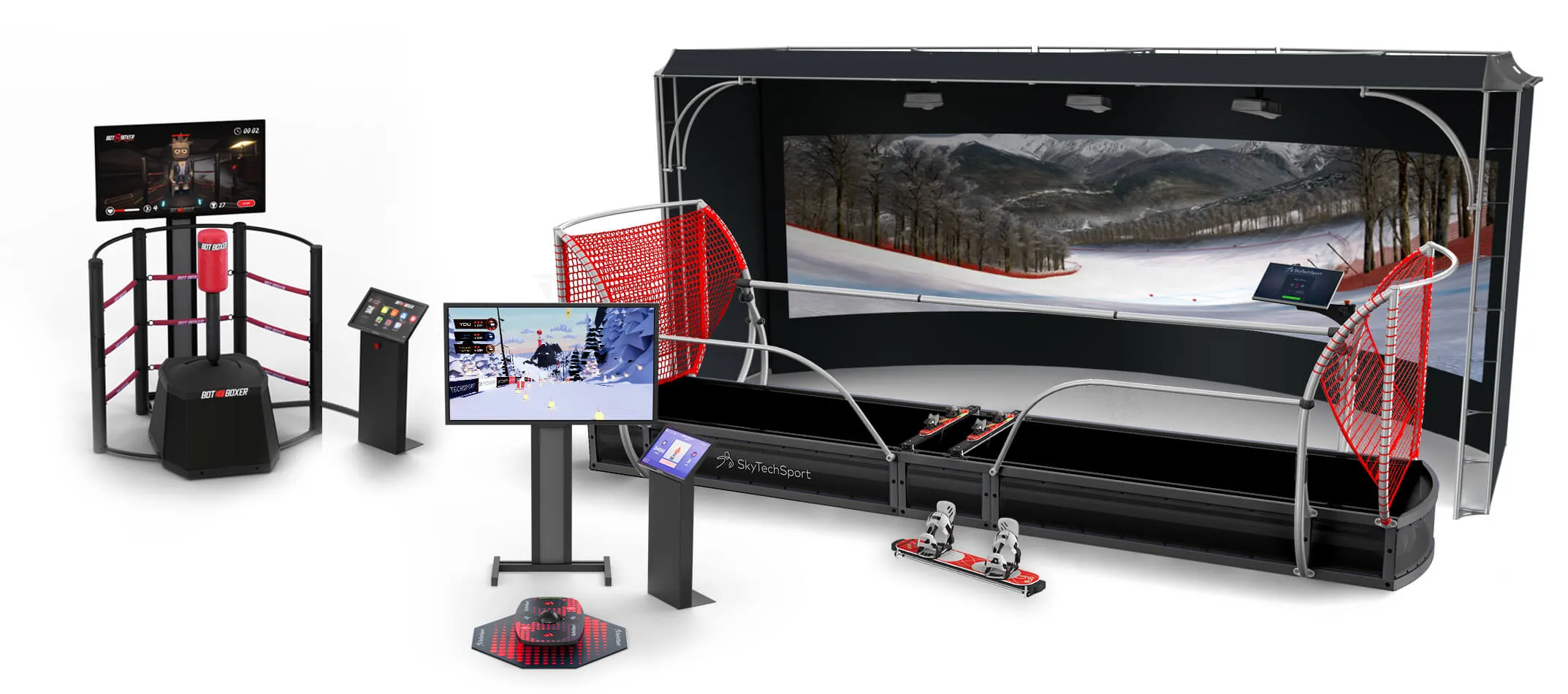
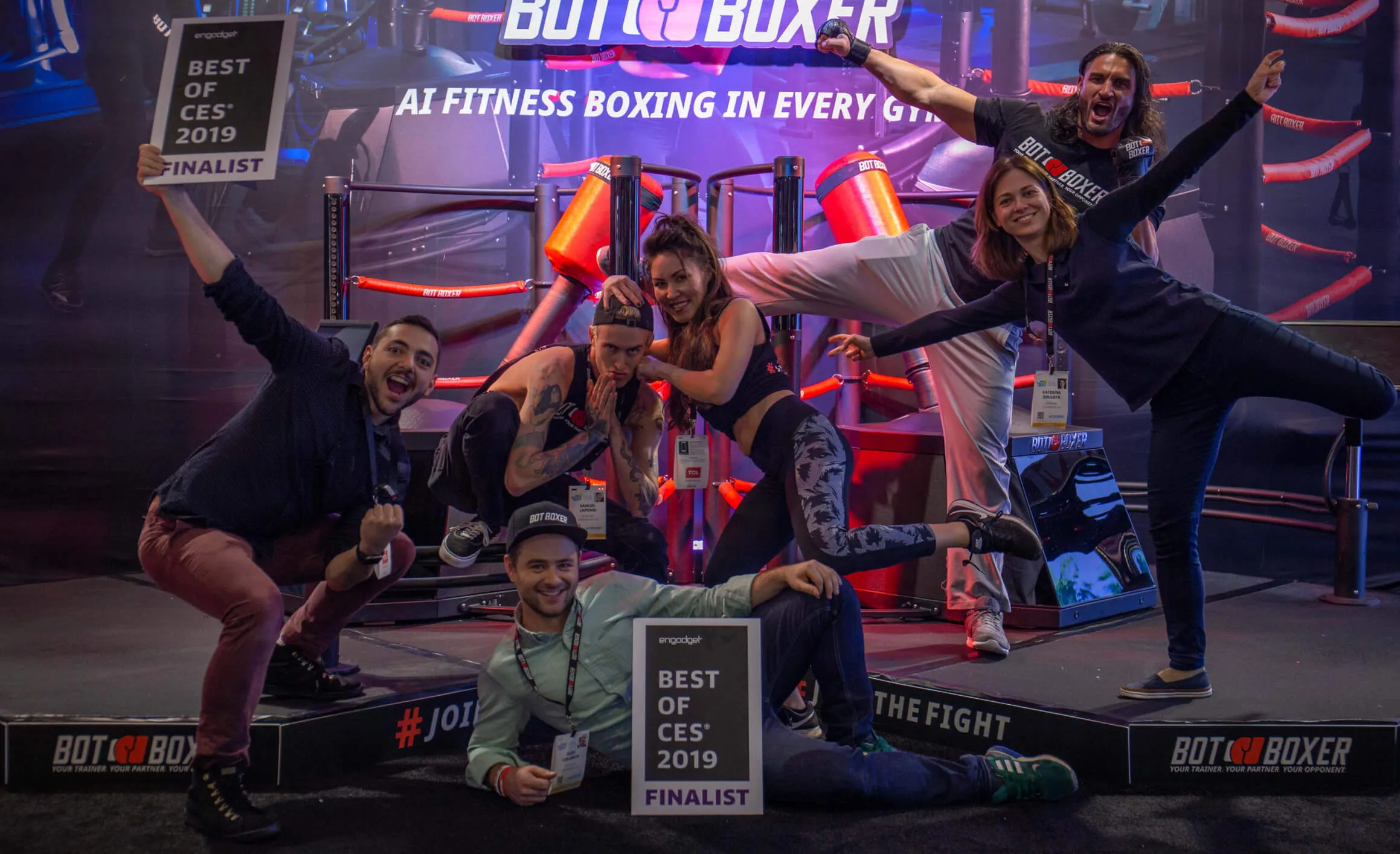
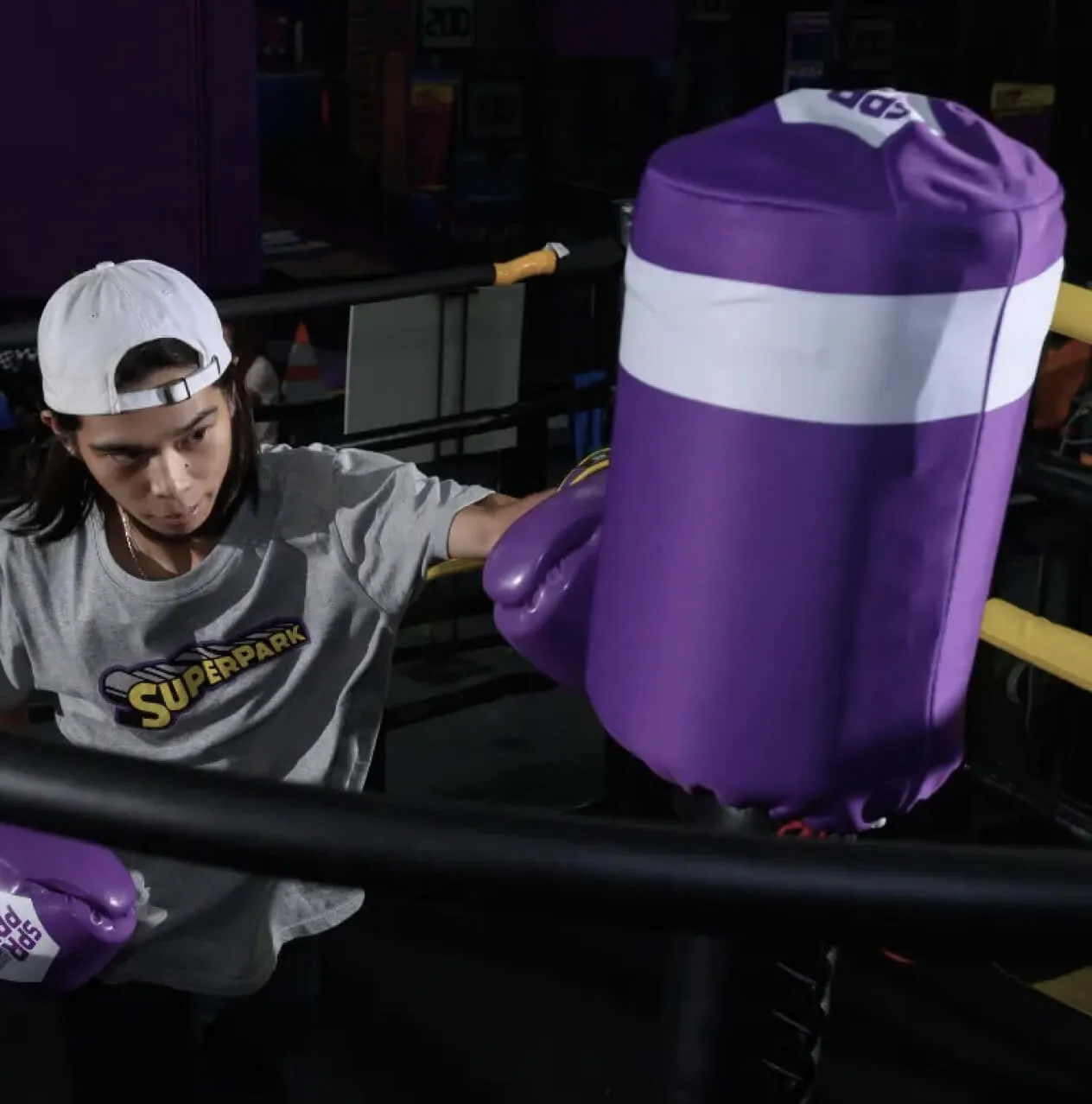
BotBoxer
World's only AI training interactive sports simulator for martial arts designed to be your personal sparring partner.
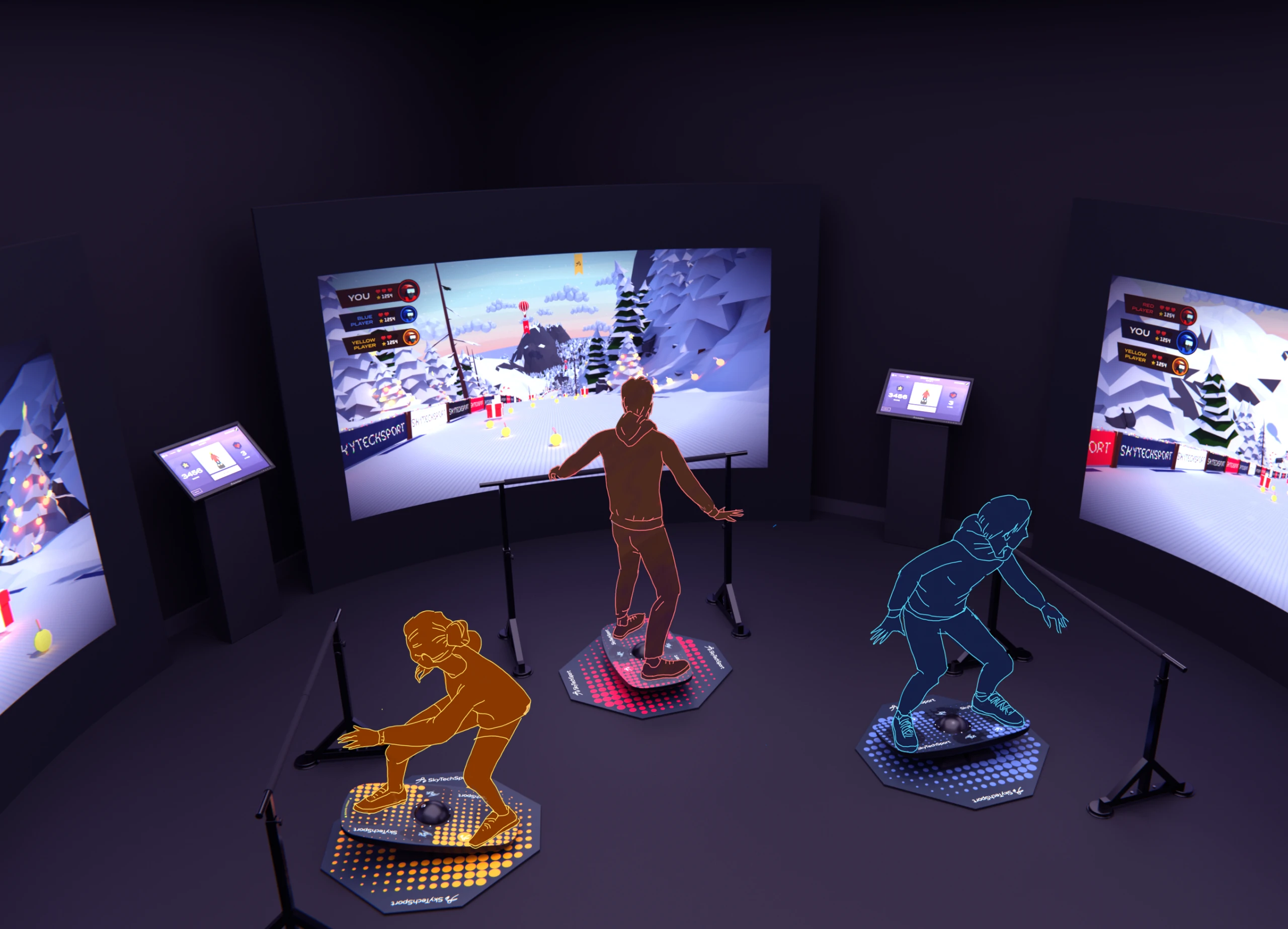
BalancePlay Pro
The revolutionary smart balance board seamlessly integrates with an immersive virtual reality system.
| Props | |
|---|---|
| heading (required) | Section heading (accent color) |
| body (required) | Body text in text cell |
| ctaLabel (required) | CTA button label |
| ctaHref (required) | CTA target |
| ctaExternal? | Open in new tab |
| slopes (required) | Array of { image, flag, city, desc } |
| Layout | |
| Mobile | grid-cols-1 — stacked vertically |
| lg+ (992) | grid-cols-3 — cell 1 = text+CTA, rest = slope cards (auto-flow) |
| Section padding | py-[60px] lg:py-[100px] bg-white |
| Container | max-w-[1440px] mx-auto px-6 lg:px-10 |
| Grid gap | gap-5 (20px) |
| Heading (accent color) | |
| Mobile | 34/40 px, font-light tracking-[-0.02em] |
| xl (1280+) | 48/56 px |
| 2xl (1440+) | 54/62 px |
| Color | text-accent (theme-aware) |
| Slope Card | |
| Layout | flex flex-col gap-5 |
| Image | w-full aspect-video object-cover rounded-lg (16:9 ratio) |
| Flag | w-[43px] h-auto object-contain flex-shrink-0 |
| City (h3) | text-xl lg:text-2xl font-normal text-accent |
| Description | text-sm text-gray-500 |
| CTA Button | |
| Style | inline-block bg-accent text-white font-medium rounded-lg py-3 px-6 |
| Hover | hover:bg-accent/90 |
Used on ski-simulators-home.astro for the World-Class Ski Slopes section. Repurposable for any "location showcase" pattern (boxing gyms, demo cities, partner facilities).

Wengen
Home of the Lauberhorn ski races
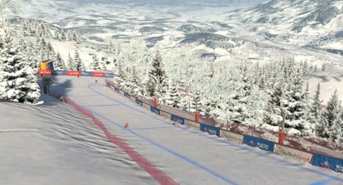

Kitzbuhel
Alpine resort known for the annual Hahnenkamm downhill race
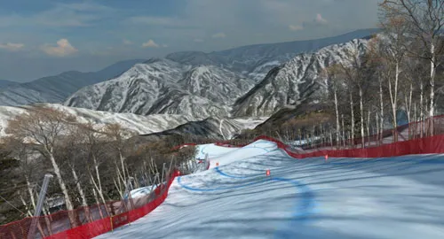

PyeongChang
2018 Olympic Winter Games resort
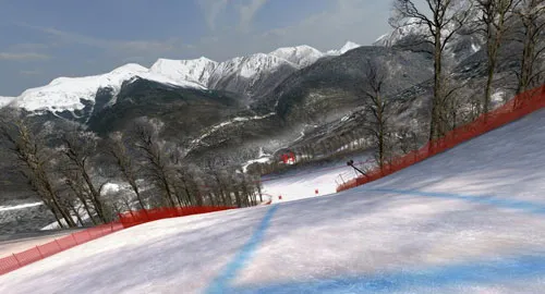

Sochi
2014 Olympic Winter Games resort
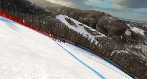

Beaver Creek
Host to the World Ski Championships
| Props | |
|---|---|
| id? | Section anchor id (for in-page links) |
| tagline? | Accent-colored label above heading (e.g. "TRAINING MODE"). Rendered as same heading tag, text-xl font-normal text-accent uppercase |
| heading (required) | Heading text |
| headingTag? | "h2" (default, larger scale) · "h3" (product-showcase scale) |
| body (required) | Body text. Supports inline HTML (e.g. <span class="text-accent">) |
| ctas? | Array of { label, href } arrow links |
| direction? | "right" (default, media right) · "left" |
| theme? | "white" (default) · "gray" (bg-gray-50) · "dark" · "darker" · "darkgray" |
| accentTheme? | "ski" | "botboxer" | "balanceplay" | "smarthoop" — overrides --color-accent for descendants |
| headingAccent? | Use text-accent for heading regardless of theme |
| image (required) | Image (or mobile fallback when video is set) |
| imageAlt? | Alt text |
| imageSrcSet? | Responsive srcset string |
| imageSizes? | Sizes attribute (auto-calculated if omitted) |
| mediaFit? | "cover" (default, photos) · "contain" (illustrations with padding) |
| mediaRatio? | "50" (default, 50/50) · "70" (media 70% / text 30%, image fills full height) |
| videoMp4? | Desktop video MP4 — if set, video shown on lg+, image as mobile fallback |
| videoWebm? | Desktop video WebM (preferred) |
| videoPoster? | Video poster image |
| imageAlwaysVisible? | Image always shown, video stacks on top on desktop (BalancePlay pattern) |
| slot "lead" | Optional content between heading and body (subtitle/lead text) |
| slot (default) | Optional content below CTAs (e.g. <StoreCard>) |
| Layout (Grid) | |
| Mobile | grid-template-columns: 1fr — stacked, media on top via order: -1 |
| lg+ (992) | 50/50 grid, min-height: 50vw |
| Text column | Always first in DOM (SEO); CSS reorders for direction="left" |
| H2 Typography (default) | |
| Mobile | 34/40, font-normal |
| md | 36/44 |
| lg | 48/56, font-light |
| 2xl | 54/62 |
| 3xl | 81/93 |
| H3 Typography (headingTag="h3") | |
| Mobile | 30/36, font-normal |
| lg | 48/1.08, font-light |
| 3xl | 72px |
| Text Column Padding | |
| h2 vertical | py-16 lg:py-24 |
| h3 vertical | py-12 lg:py-16 xl:py-24 |
| Horizontal (media right) | px-6 lg:pl-20 lg:pr-12 + .container-fluid-padding >1441px |
| Horizontal (media left) | px-6 lg:pl-12 lg:pr-20 + .container-fluid-padding-r >1441px |
| Theme Color Logic | |
| "white" | bg-white · heading/text text-black |
| "gray" | bg-gray-50 · heading/text text-black |
| "dark" isDark | bg-dark (#17191d) · heading text-white · text text-gray-300 |
| "darker" isDark | bg-darker (#121217) · heading text-white · text text-gray-300 |
| "darkgray" isDark | bg-gray-750 (#23252a) · heading text-white · text text-gray-300 |
| CTA Arrow Links | |
| Layout | flex flex-wrap gap-6 |
| Arrow | Inline SVG 20x20 with text-accent |
| Hover | light: text-black/60 · dark: text-white/60 |
| Media Column | |
| Mobile aspect | aspect-square |
| Desktop | lg:aspect-auto (stretches to grid row) |
| cover | absolute inset-0 w-full h-full object-cover |
| contain | Container p-8 lg:p-16; image object-contain |
| Video pattern | video hidden lg:block · image lg:hidden |
| imageAlwaysVisible | image always visible · video overlays on lg+ |
| Product Theme Classes | |
| theme-ski | --color-accent: #ea484d (red) |
| theme-botboxer | --color-accent: #c6f144 (lime) |
| theme-balanceplay | --color-accent: #8576ff (violet) |
| theme-smarthoop | --color-accent: #ff6c31 (orange) |
Unified component replacing former ContentMedia + ProductSplit. Handles all 50/50 split-section patterns: content pages (h2, image-only), product showcases (h3, video+image, accentTheme), and everything in between.
Choose Your Space
Enjoy the SkyTechSport sports simulator at home or run a business.
Whether you want to enjoy snow-white slopes 24/7 for yourself or you would like to give your customers an authentic and engaging experience — we will help you choose the model and configuration.
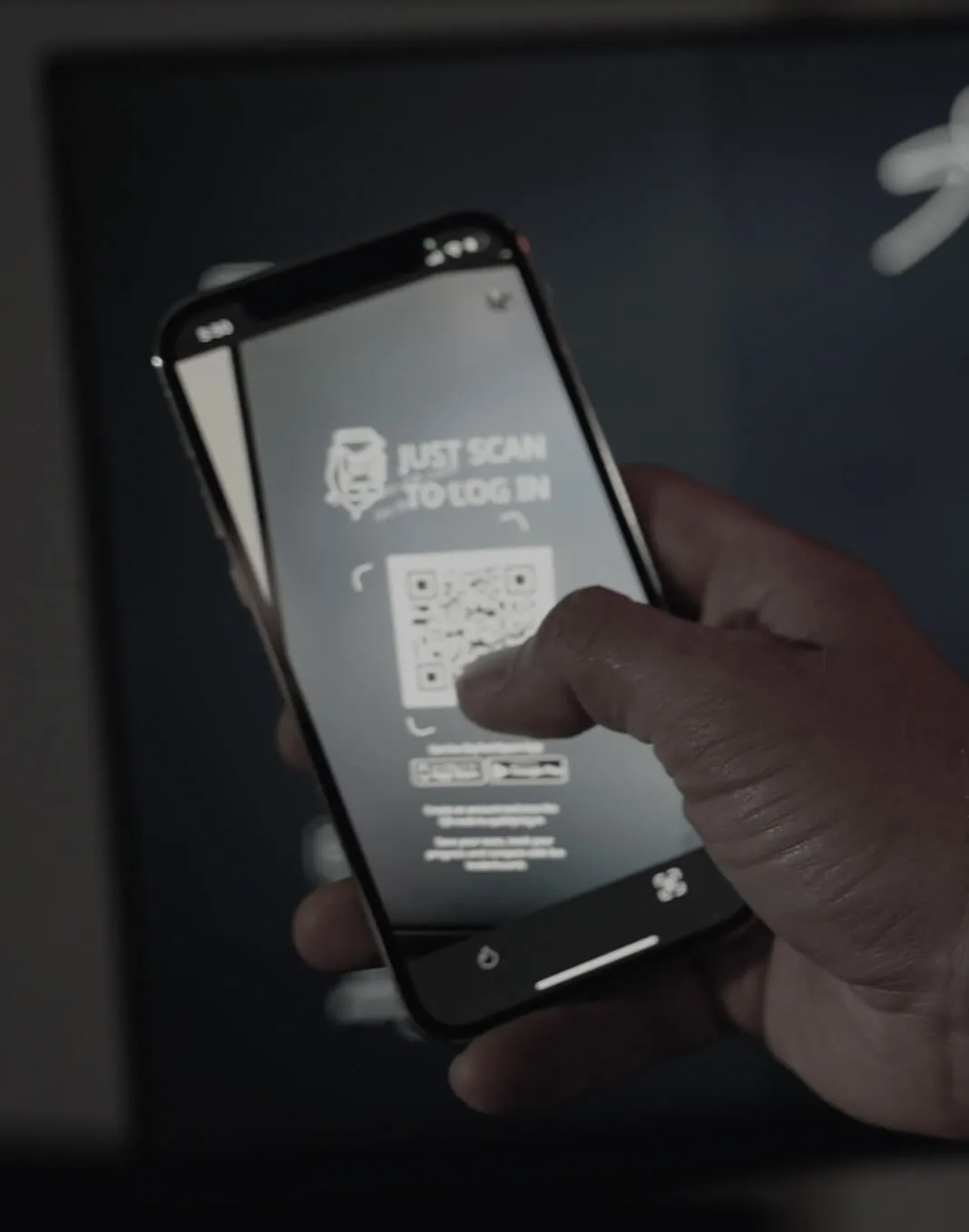
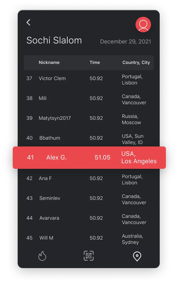
Access Your Stats, Live Leaderboards and More
Quickly log onto any SkyTechSport interactive sports simulator with your mobile device and track your data during training sessions, races, or fights.
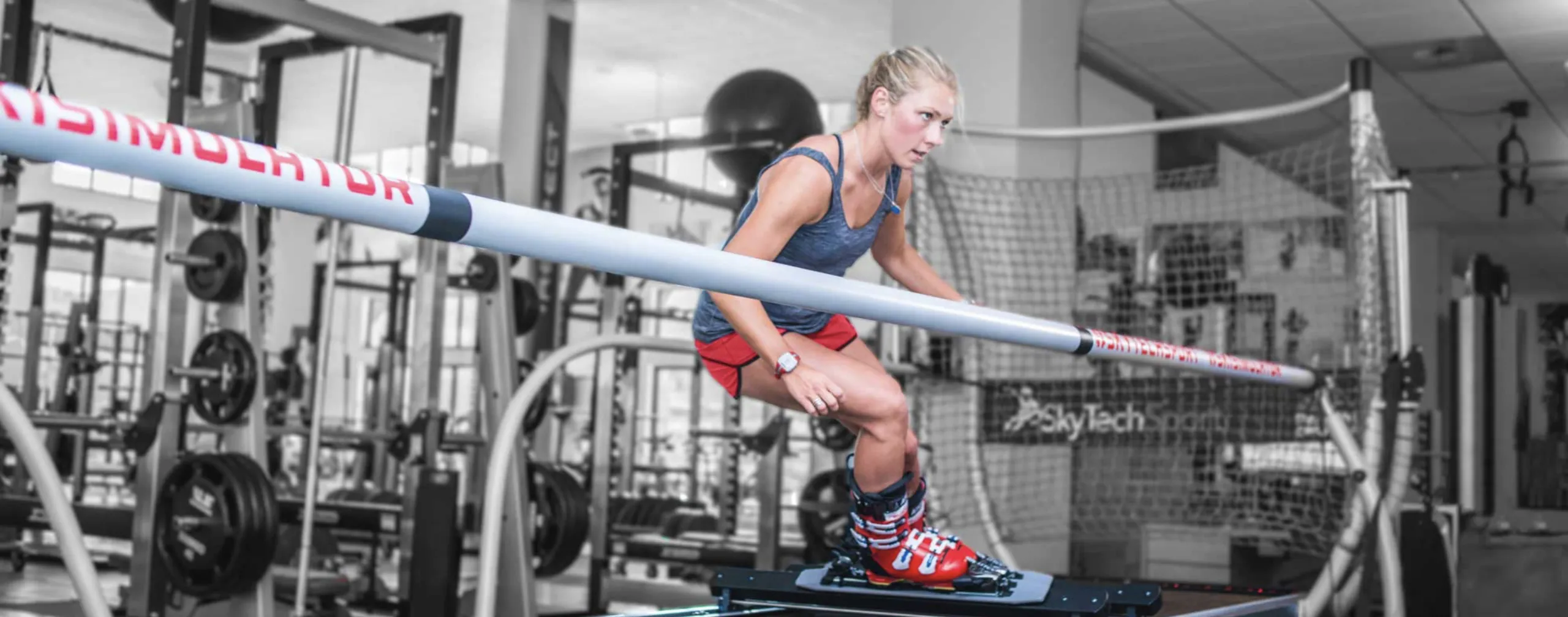
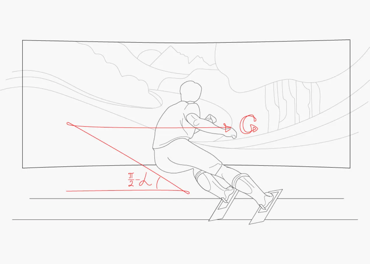
Real G-force Is Our Secret
After years of crafting our ski simulators to perfection, we have achieved the identical G-force you experience going down the slope.
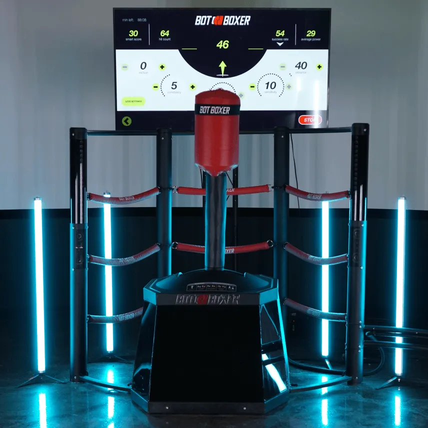
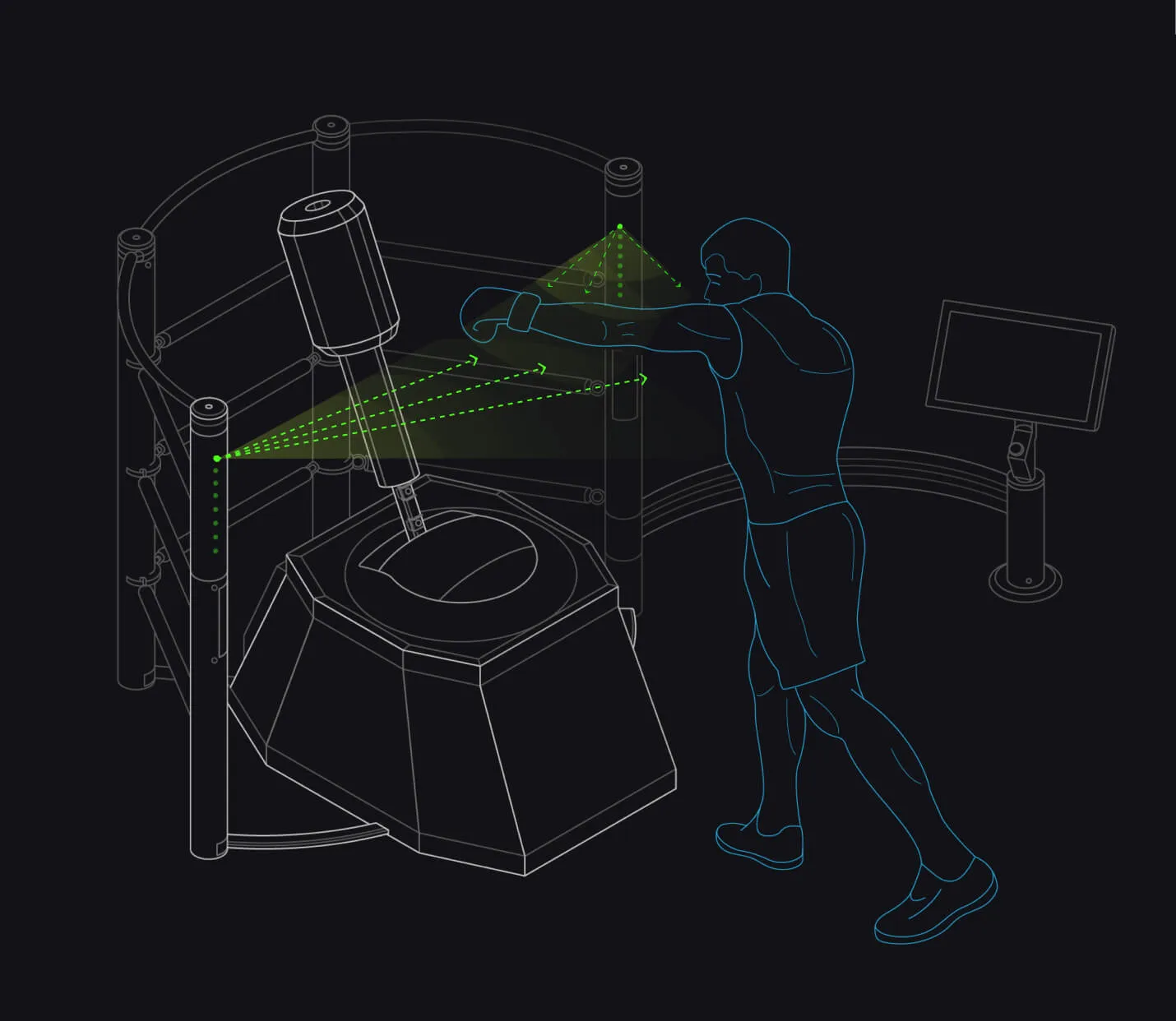
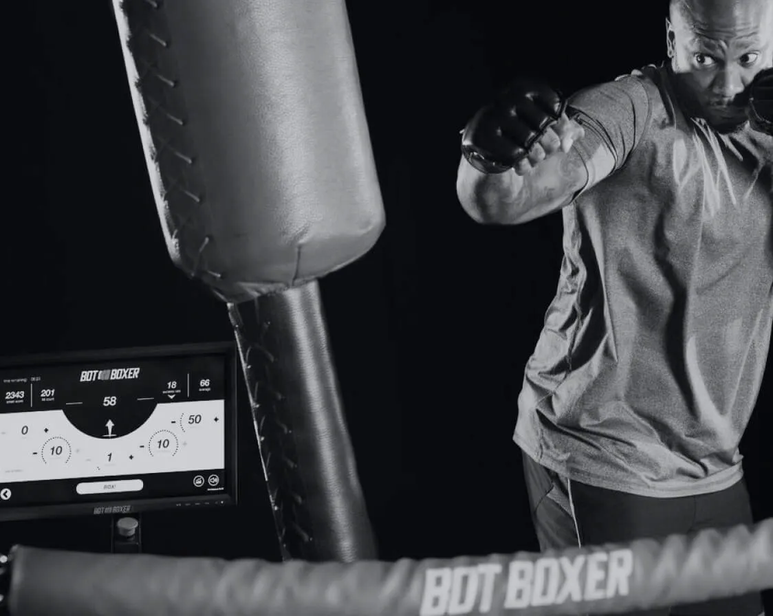
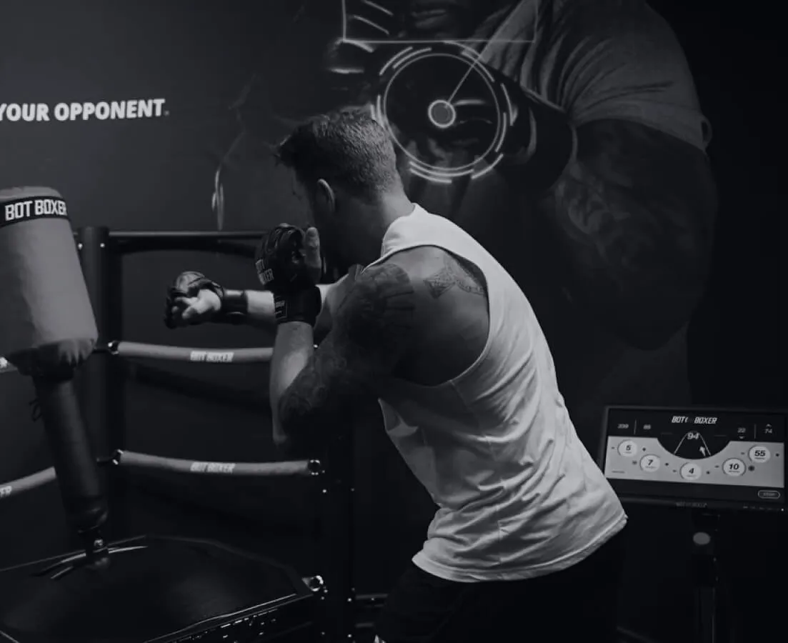
Real-Time Vision
High-tech computer vision tracks your every move. AI sensors predict oncoming punches and calculate the most efficient way to dodge your shot.
Training Mode
Intense and structured workouts for serious boxers.
Adjust different parameters for the BotBoxer to match your skill level and train to become better.
Drills Mode
Practice to perfection.
Choose a combo from a wide variety of options and refine your technique of delivering a flawless punch every single set.
Real-Time Vision
High-tech computer vision tracks your every move. AI sensors predict oncoming punches and calculate the most efficient way to dodge your shot.
Precision Sensors
Hidden within the punching bag, high-sensitivity sensors read the force, velocity, and direction of every punch to give you instant feedback.
Terms of Service
Last updated: January 2025
1. Introduction
Welcome to SkyTechSport. These Terms of Service govern your use of our website and services.
1.1 Definitions
Throughout these terms, "we", "us", and "our" refer to SkyTechSport LLC.
- Service means the SkyTechSport website and all related services
- User means any person who accesses or uses the Service
SkyTechSport reserves the right to modify these terms at any time.
For questions, please contact us.
Who We Are
We are a team of highly-skilled engineers, pro athletes, tech geeks and visionaries
SkyTechSport was born from the enthusiasm of highly-skilled engineers, pro athletes, tech geeks, and visionaries.
We challenge the status quo
We felt that the entire gym equipment industry has been stagnant for decades.
Our simulators are for accomplishing your ambitious goals
With years of research we were able to bring the best innovations upfront.
Real Sports -- Real Fun
Great For Any Skill Level
Our simulators are perfect for introducing beginners to intimidating sports.
Multiple Rental Options
Available in different sizes, models and setups.
Our Staff Will Guide You
From the planning phase to the event itself, our team is here to help you.
Intelligence at the Core

High Sensitivity Sensors
Multiple sensors allow the simulator to track every motion second by second.

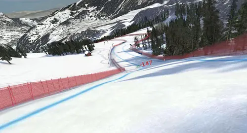
World-Famous Ski Resorts
Decide where you'd like to go skiing: Beaver Creek, Kitzbuhel, PyeongChang.

Fully Immersive Virtual Reality
Bring the mountains to you in the comfort of your own home.

Powerful Motors Create Real G-Force
Computer-controlled motors generate all the forces of skiing.

Software Creates the Sensation of Skiing
Ski multiple trails and race courses.

Live Leaderboards
Compete with skiers all around the world.
Mountains of Business Ideas

Making That First Run
Learn the basics of skiing indoors in a safe and controlled environment.

Getting a Workout
Great cardio and strength exercise. Build ski-specific muscles.

Improve Your Skiing
Train year-round to improve your technique.
Two-Column Layout
High Sensitivity Sensors
Multiple sensors allow the simulator to track every motion.
World-Famous Ski Resorts
Decide where you'd like to go skiing.
Fully Immersive Virtual Reality
Bring the mountains to you.
Powerful Motors
Computer-controlled motors generate all the forces of skiing.
| Props | |
|---|---|
| heading? | Optional section heading (uses SectionHeading) |
| subtitle? | Lead paragraph below heading |
| features (required) | Array of { image, imageAlt, imageSrcSet, imageSizes, heading, text } |
| columns? | 2 (default) · 3 — columns on lg+ |
| theme? | "white" (default) · "gray" · "dark" |
| headingAccent? | Section heading uses accent color |
| Layout | |
| Section | py-16 lg:py-24 + bg per theme |
| Container | max-w-[1440px] mx-auto px-6 lg:px-10 |
| Heading bottom margin | mb-12 |
| Grid (2 cols) | grid-cols-1 md:grid-cols-2 lg:grid-cols-2 gap-8 lg:gap-12 |
| Grid (3 cols) | grid-cols-1 md:grid-cols-2 lg:grid-cols-3 |
| Feature Card | |
| Image | w-full rounded-lg mb-5 (auto-height, supports srcset) |
| Heading (h3) | text-xl lg:text-2xl font-normal |
| Heading color | light: text-gray-900 · dark: text-white |
| Heading margin | mb-3 |
| Body | text-base leading-relaxed |
| Body color | light: text-gray-600 · dark: text-gray-300 |
Replaces 4 inline copies across ski-simulators-business ("G-Force & VR Features", "Most Up to Date Ski Technology") and ski-simulators-home ("Expand Your Limits", "Set Up a Competition" pair). Card heading style was normalized: was previously font-semibold text-primary in some places — now uniform font-normal text-gray-900.
The Most Up to Date Ski Technology
Host a League and Race Events
Invite your clients to a challenge and see who's the fastest. Slalom, GS or Downhill for a thrilling race.
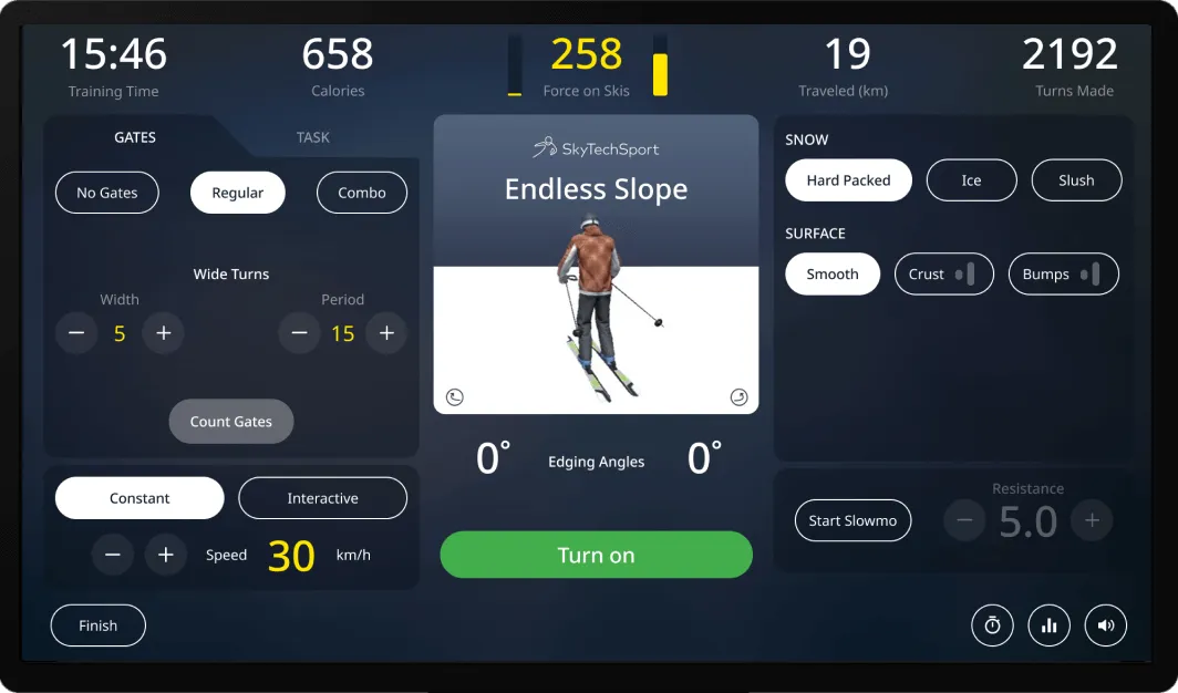
Infinite Slope With Infinite Possibilities
Customers can adjust snow conditions on ski machines like ice, slush or hard-packed snow, add bumps or set their own slalom course.
Trusted by professional instructors and national teams

Official training equipment of the U.S. Ski Team

Endorsed by PSIA-AASI certified instructors
Get Inspiration from Previous Projects
Racer Ski Simulator
Starting at $33,110
President Lux Ski Simulator
Starting at $66,110
Olymp Ski Simulator
Starting at $87,780
Build Your Own Ski Simulator
Select the size, color, screen type, and other accessories.
Make Your Own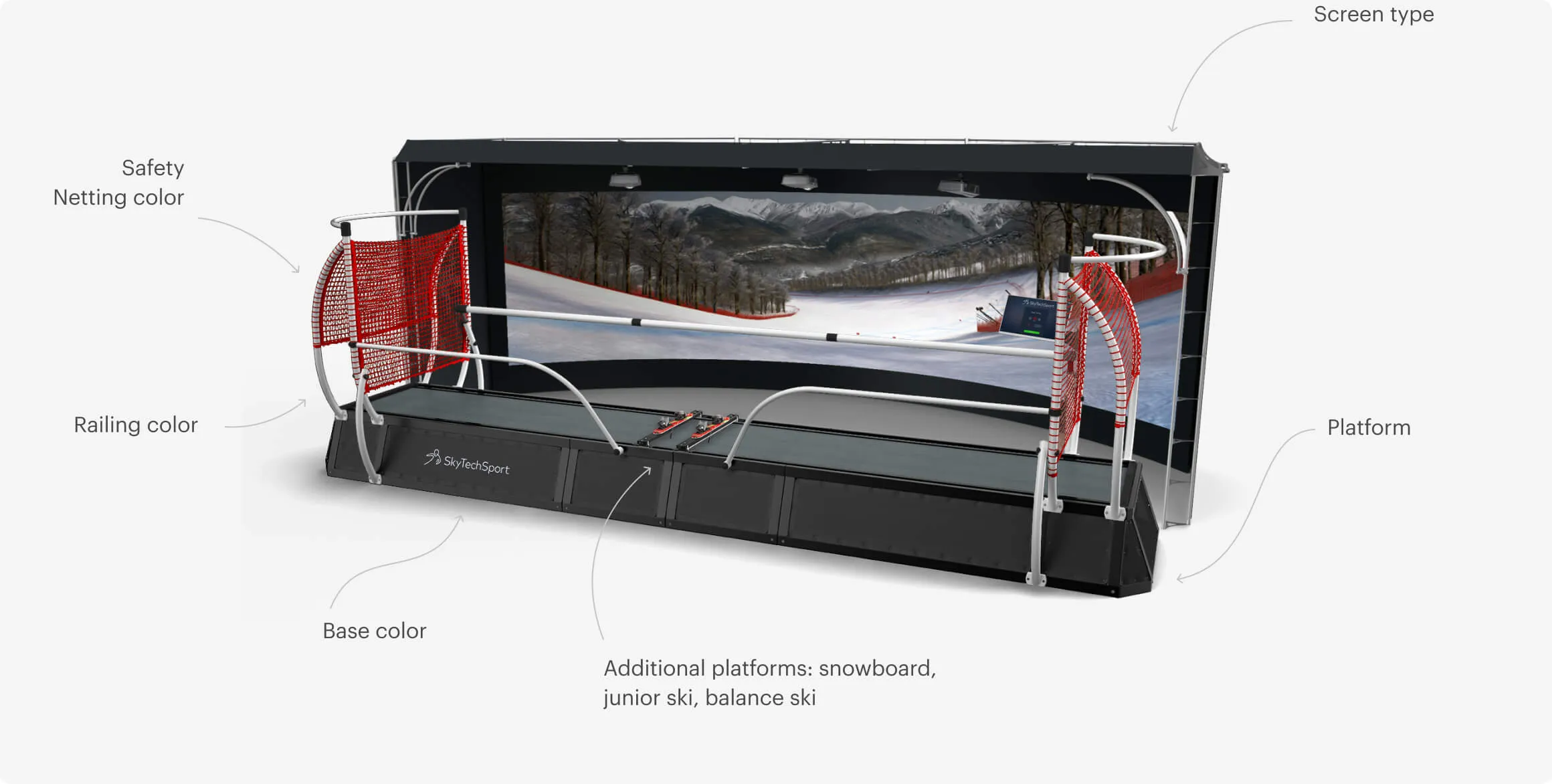
| Props | |
|---|---|
| heading? | Section heading (default: "Testimonials") |
| testimonials (required) | Array of { name, title, quote, image } |
| theme? | "white" (default) · "dark" (bg-dark, accent names, white quotes) |
Testimonials
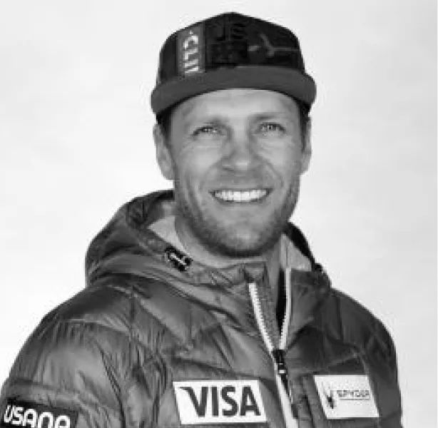
Steven Nyman
US Ski Team, World Cup Winner Downhill
“A great way to teach people how to get over the outside ski.”
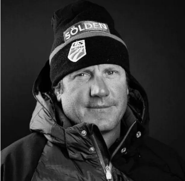
Sasha Rearick
US Ski Team Men's Head Coach
“Getting on the Ski Simulator is going to prepare you physically.”
Andrew Weibrecht
US Ski Team, Two-time Olympic medalist
“You're not gonna hurt yourself, there's no stress.”
Mikaela Shiffrin
Three-time Overall World Cup champion
“This is a great way to get that time on snow and improve a lot faster.”
Bob Thomas
Founder of Vertical Drop Ski Shop
“It's just like ski racing!”
Testimonials
Christina Cruz
Olympic Boxer Ranked #1 for team USA, 2 time World medalist
“BotBoxer is a great boxing tool to enhance accuracy and increase strength of your punches.”
Tony Jeffries
Olympic bronze in 2008, retired as an undefeated pro boxer.
“This bag is unbelievable. I know I can punch fast, but this thing was even faster!”
Austen Ford
Martial Arts Instructor (Brass Boxing & Jiu Jitsu)
“It blew me away. Very impressive! Speed, reaction, fun, functionality.”
| Props | |
|---|---|
| heading (required) | Section heading |
| subtitle? | Lead paragraph |
| cards (required) | Array of plain strings (one per card) |
| columns? | 2 (default) · 3 |
| theme? | "gray" (default) · "white" · "dark" |
| Layout | |
| Section | py-16 lg:py-24 + theme bg |
| Container | max-w-[1440px] mx-auto px-6 lg:px-10 |
| Heading margin | mb-10 |
| Grid | grid-cols-1 md:grid-cols-2 [lg:grid-cols-3] with gap-6 |
| Card Shell | |
| Background | light: bg-white · dark: bg-gray-800 |
| Padding · radius | rounded-xl p-6 |
| Card Text | |
| Style | text-base leading-relaxed |
| Color | light: text-gray-600 · dark: text-gray-300 |
Lighter sibling of FeatureGrid for cases where images aren't needed. Used on ski-simulators-business for "Indoor Skiing for Everyone".
Indoor Skiing for Everyone!
By adding specialized adaptive platforms, our ski and snowboard simulator can bring the joy of real skiing to any of your customers.
Tested in cooperation with U.S. Ski and Snowboard Association our simulators break boundaries and limitations.
Add an adaptive ski platform within seconds and share the joy of speeding down the slope with everyone.
The Story of Two Simulators
Ski simulator concept began, SkyTechSport was created
Ski simulator concept began, SkyTechSport was created
Launch of office in Munich, Germany.
Launch of office in Munich, Germany.
SkyTechSport released a custom graphics engine.
SkyTechSport released a custom graphics engine.
BotBoxer prototype completed.
BotBoxer prototype completed.
BotBoxer presented to the public.
BotBoxer presented to the public.
Launch of BalancePlay Pro.
Launch of BalancePlay Pro.
| Props | |
|---|---|
| tagline? | Small tagline above heading (e.g. "Reach New Heights") |
| heading (required) | Main heading (uses accent color, font-light on lg+) |
| screenshot (required) | App screenshot/preview image |
| screenshotAlt (required) | Alt text |
| body (required) | Body text below screenshot |
| iosHref (required) | iOS App Store URL |
| androidHref (required) | Android Play Store URL |
| theme? | "white" (default) · "gray" |
| Layout | |
| Section | py-16 lg:py-24 + theme bg |
| Container | max-w-[1440px] mx-auto px-6 lg:px-10 flex flex-col items-center |
| Screenshot wrapper | w-full max-w-[800px] mx-auto mb-8 |
| Tagline | |
| Mobile | 22/28 px font-light text-gray-800 |
| md (768+) | 24/30 px |
| lg (992+) | 30/36 px |
| 2xl (1440+) | 34/42 px |
| Spacing | text-center mb-2 |
| Heading (accent color) | |
| Mobile | 34/40 px font-normal |
| md (768+) | 36/44 px |
| lg (992+) | 48/56 px font-light |
| 2xl (1440+) | 54/62 px |
| Color · spacing | text-accent text-center mb-8 |
| Body Text | |
| Style | text-base text-gray-600 text-center max-w-2xl mx-auto mb-8 |
| Download Links (arrow style) | |
| Layout | flex flex-wrap justify-center gap-6 |
| Link | inline-flex items-center gap-2.5 text-black hover:text-black/60 |
| Arrow icon | w-5 h-5 text-accent — SVG arrow |
| Behavior | Both links open in new tab (target="_blank" rel="noopener") |
Used on ski-simulators-home.astro for the SkyTechSport app pitch. Reusable on any product page that needs a "download our app" placement.
Reach New Heights
Access Your Stats, Leaderboard Rankings and More
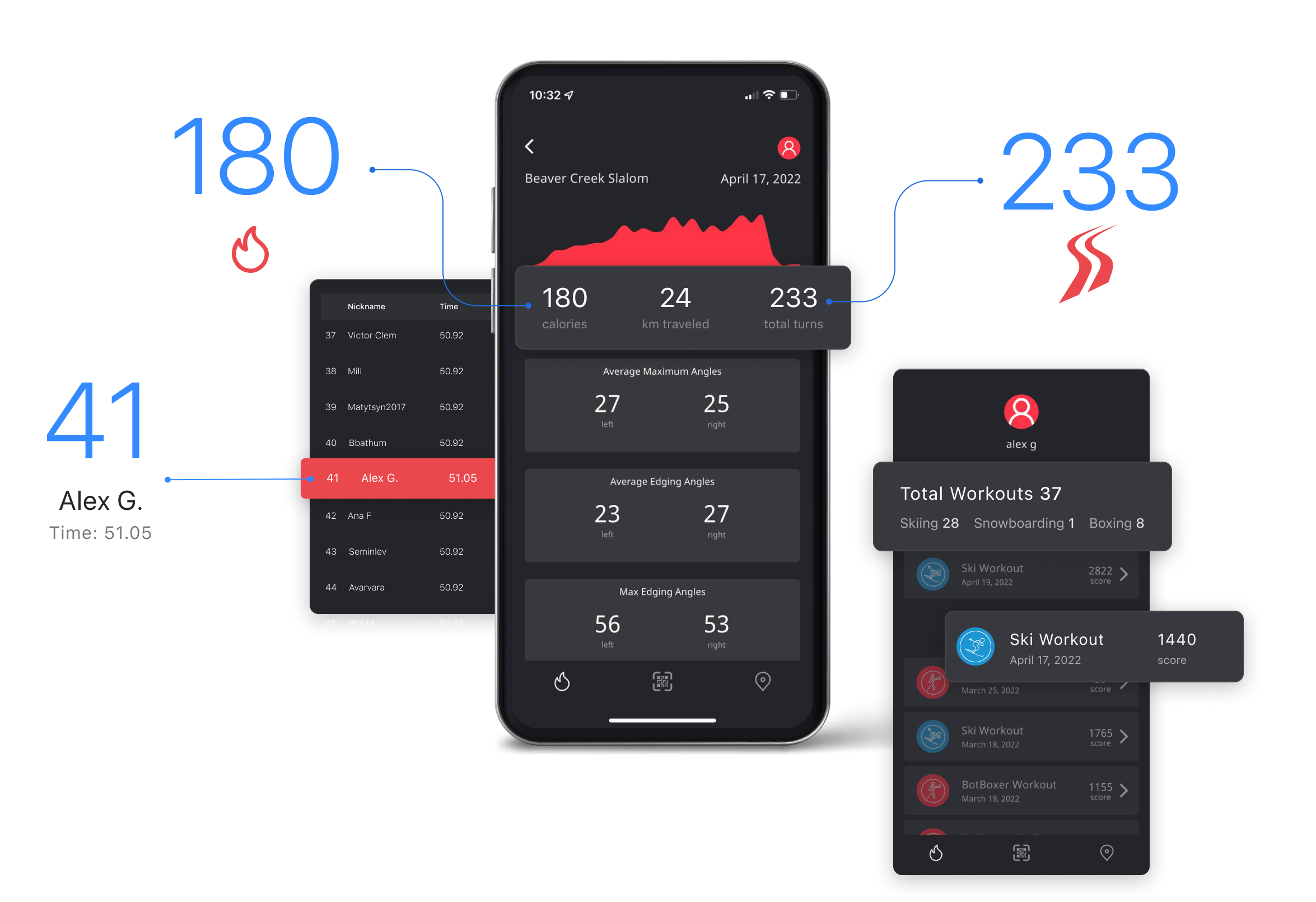
The quick QR login allows you to track every session on the ski simulator. Push yourself higher, challenge your friends, and race with anyone in the world.
| Shared Props | |
|---|---|
| variant? | "slider" (default) | "iframe" |
| heading (required) | Passed to SectionHeading |
| body (required) | Lead text between heading and CTA |
| ctaLabel (required) | Button label |
| ctaHref (required) | Button target URL |
| Slider Variant Props | |
| beforeImage | Bottom layer image src (room without simulator) |
| afterImage | Top layer image src (room with simulator) |
| beforeAlt? | Default: "Before configuration" |
| afterAlt? | Default: "After configuration" |
| Iframe Variant Props | |
| iframeSrc? | Default: /sections/hotspot-configurator.html |
| iframeTitle? | A11y title (default "Interactive Sports Simulator Configurator") |
| Slider Layout | |
| Container | max-w-[1440px] mx-auto |
| Height | h-[40vh] → md:h-[60vh] → lg:h-[70vh] → xl:h-[80vh] |
| Mobile (<md) | Slider handle hidden, only "after" image shown full |
| Interaction | Drag handle via pointer events, clip-path: inset() |
| Handle | |
| Line | 2px, white gradient (transparent → white → transparent) |
| Knob | 40px circle, white bg, <> arrows icon, shadow-lg |
| Text + CTA | |
| Container | max-w-[900px] mx-auto px-6 lg:px-20 py-10 lg:py-16 |
| Heading | SectionHeading (default variant black, h2) |
| Body | text-base md:text-lg font-normal text-black leading-[1.6] mt-6 mb-8 text-center |
| CTA | Button size="lg" |
Slider variant matches original Webflow before/after slider. Iframe variant kept for hotspot-configurator use case.
Build Your Own Sports Simulator
Play with our easy configurator and design your own custom SkyTechSport interactive simulator.
Build Your Own Sports Simulator
Play with our easy configurator and design your own custom SkyTechSport interactive simulator.
| Props | |
|---|---|
| text (required) | Banner text |
| logo? | Optional partner/source logo |
| logoAlt? | Logo alt |
| logoSize? | Tailwind height class (default h-8) |
| linkLabel (required) | Right-side link label |
| linkHref (required) | Link target |
| linkExternal? | Open in new tab |
| Layout | |
| Section | py-8 bg-gray-50 |
| Inner card | bg-white rounded-xl p-6 lg:p-8 |
| Direction | Mobile column, sm+ row with space-between |
| Text | |
| Style | text-lg font-semibold text-gray-800 |
| Link | |
| Style | text-primary font-medium hover:underline + arrow SVG |
Used on ski-simulators-business for "Fast and Flexible Business Financing" partner banner.
Fast and Flexible Business Financing
| Props | |
|---|---|
| icon (required) | Large icon SVG/PNG |
| iconAlt? | Alt text |
| heading (required) | Banner heading (h2) |
| body (required) | Body text |
| ctaLabel (required) | Button label |
| ctaHref (required) | Button target |
| ctaExternal? | Open in new tab |
| ctaColor? | "lime" (default) · "accent" · "white" |
| Layout | |
| Outer section | py-16 lg:py-24 bg-gray-900 |
| Inner card | bg-gray-800 rounded-xl p-8 lg:p-12 |
| Direction | Mobile column, lg+ row, gap-8 |
| Icon | |
| Size | w-24 h-24 lg:w-32 lg:h-32 flex-shrink-0 |
| Heading + Body | |
| Heading (h2) | heading-card text-white mb-3 |
| Body | text-base text-gray-300 mb-6 |
| CTA Button | |
| Style | inline-flex px-6 py-3 font-medium rounded-lg |
| lime variant | bg-lime text-gray-900 |
| accent variant | bg-accent text-white |
| white variant | bg-white text-gray-900 |
Used on ski-simulators-business for "Custom Software". Repurposable for any cross-page promo banner.

Custom Software Focused On Your Success
Custom sports simulator software for entertainment centers, parks, gyms, and studios.
Learn more| Props | |
|---|---|
| videoMp4 (required) | MP4 source URL |
| videoWebm? | WebM source (preferred, MP4 fallback) |
| poster (required) | Poster image (shown before video loads) |
| logo? | Logo SVG/PNG above heading (h-12, mb-6) |
| logoAlt? | Logo alt text |
| heading (required) | Passed to SectionHeading |
| body (required) | Lead text between heading and CTA |
| ctaLabel (required) | Button label |
| ctaHref (required) | Button target |
| ctaExternal? | If true, adds target="_blank" rel="noopener" |
| minHeight? | "90vh" (default) · "80vh" · "70vh" |
| headingVariant? | "white" (default) · "accent" |
| Layout | |
| Section | relative overflow-hidden flex items-center + minHeight |
| Content max-width | max-w-[900px] mx-auto |
| Content padding | px-6 lg:px-20 py-20 |
| Alignment | text-center |
| Content z-index | z-10 |
| Background Video | |
| Behavior | autoplay loop muted playsinline |
| Fit | absolute inset-0 w-full h-full object-cover |
| Sources | WebM first, MP4 fallback, poster shown until first frame |
| Overlay | |
| Color | bg-black/40 (40% opacity) |
| aria-hidden | true (decorative) |
| Logo (optional) | |
| Size | h-12 (48px), auto width |
| Spacing | mx-auto mb-6 |
| Body Text | |
| Style | text-base md:text-lg leading-[1.6] mt-6 mb-8 |
| Color | text-white (white variant) · text-black (accent variant) |
| CTA Button | |
| Style | px-8 py-4 bg-accent text-white font-medium rounded-lg |
| Hover | hover:bg-accent/90 |
Used on index.astro ("STS Plus Subscription"). Pattern fits any "epic CTA" placement: subscription, premium upsell, hero-style call-to-action with cinematic atmosphere.
SkyTechSport Plus Subscription
Get the latest trails, games, and experiences magically delivered right to your interactive sports simulator.
Explore SkyTechSport Plus| cross-promo Variant Differences | |
|---|---|
| Height | h-[90vh] (fixed) vs min-h-[90vh] (hero) |
| Overlay | Spotlight (gradient + radial vignette) vs flat bg-black/40 |
| Content max-width | max-w-[640px] vs max-w-[900px] |
| Heading scale | Base h2 (34px / 40px from global.css) vs SectionHeading scale (34→56→84) |
| Logo | h-14 w-auto vs h-12 mx-auto mb-6 |
| Layout | flex flex-col items-center text-center gap-5 vs flat text-center with mt-6/mb-8 spacing |
| Body | text-base font-light text-white/90 (lighter, smaller) |
| Button | Smaller padding py-3 px-6 vs py-4 px-8 |
Used on ski-simulators-home.astro as a secondary STS Plus cross-promo (the primary lives on index.astro). Pattern fits any "by the way, also check this out" placement that doesn't deserve full hero gravitas.
SkyTechSport Plus Subscription
Get the latest trails, games, and experiences delivered right to your ski simulator.
Get SkyTechSport PlusContact Us
Have questions about our simulators? Want to book a meeting or a demo? Fill out the form below and our team will get back to you.
Fill the form
Contact Us
Book a meeting or fill out the form
This is the split layout variant with a background image overlay and glass-effect form panel.
Book A Meeting| Props | |
|---|---|
| heading (required) | Card heading (h3 scale) |
| body (required) | Body text below heading |
| formAction? | Submit endpoint (currently unused — logs to console) |
| successMessage? | Text shown after submit (default provided) |
| Card Shell | |
| Background | bg-gray-100 |
| Border radius · padding | rounded-3xl p-4 lg:p-5 xl:p-8 |
| Form Fields | |
| email (required) | Email input + privacy disclaimer |
| city (required) | Text input |
| phone (optional) | Tel input + SMS consent checkbox + disclaimer |
| Spacing | space-y-4 between groups |
| Input Style | |
| Style | w-full px-4 py-3.5 bg-white rounded-xl text-sm text-gray-650 |
| Placeholder | placeholder:text-gray-400 |
| Border / focus | border-0 outline-none focus:ring-2 focus:ring-accent/30 |
| Label | text-sm text-gray-500 mb-1.5 |
| Submit Button | |
| Style | w-full py-3.5 bg-accent text-white font-medium rounded-lg |
| Submit Behavior | |
| Listener | Document-level submit event delegation, idempotent install guard |
| Action | preventDefault → logs FormData to console → hides form → shows .notify-success |
| Scoping | Uses form.closest(".notify-me-form") — multiple instances on a page work independently |
| Backend | TODO: replace console.log with real API call |
| Success State | |
| Style | bg-green/10 rounded-lg text-sm text-green font-medium |
When extracting future inline forms, follow the same pattern: .notify-form inside .notify-me-form, sibling .notify-success div. The single document-level handler picks them all up.
No Sports Simulators In Your City Yet?
Notify me when the SkyTechSport simulator in my area becomes available!
Thank you! When simulators become available in your area, we will notify you.
| Props (all optional, defaults match ski-business usage) | |
|---|---|
| heading? | Default "Revenue Calculator" |
| body? | Default "Move the sliders to see..." |
| ctaLabel? | Default "Choose a simulator" |
| ctaHref? | Default config.skytechsport.com |
| ctaExternal? | Default true |
| costMin/Max/Step/Default? | Cost slider params (20/200/5/100) |
| sessionsMin/Max/Default? | Sessions slider params (2/36/18) |
| workDays? | Default 355 days/year |
| Layout | |
| Section | py-16 lg:py-24 bg-dark text-white |
| Grid | Mobile single col, lg+ 2-col with gap-8 lg:gap-16 items-center |
| Calc widget | bg-gray-800/50 rounded-xl p-6 lg:p-8 |
| Revenue Display | |
| Style | text-3xl lg:text-4xl font-bold text-white |
| Format | $N,NNN,NNN (comma thousand separators) |
| Sliders | |
| Track | w-full h-1 bg-gray-600 rounded-lg |
| Thumb color | accent-white |
| Min/max labels | text-xs text-gray-500 mt-1 |
| Behavior | |
| Calculation | cost × sessions × workDays |
| Update trigger | input events on both sliders |
| Idempotent install | Guard via window.__revenueCalcInstalled — safe to render multiple instances |
Self-contained: bundled JS uses scoped queries (.revenue-calc root + child class hooks), so multiple calculators on a page work independently.
Your revenue for the year
$639,000
*Based on 355 work days a year
ExternalEmbed Component
Lazy-loads external scripts/styles when scrolled into view.
Used on /contact for the 3D globe widget.
| Props | |
|---|---|
| tagline (required) | Accent-colored label above heading (rendered as <h2>, text-xl text-accent uppercase) |
| heading (required) | Section heading (rendered as <h3>, text-[30px] font-light) |
| body (required) | Body text |
| artworkImage (required) | Background image for artwork section |
| artworkTitle (required) | Game title on artwork overlay (rendered as <h2>) |
| artworkGradient? | CSS gradient overlay on artwork (e.g. "linear-gradient(transparent 41%, rgba(0,0,0,0.84))") |
| artworkHeight? | Tailwind height class (default: "h-[450px]") |
| brandLabel? | Brand label above title (default: "BotBoxer Play!") |
| footerText? | Optional paragraph below artwork |
| Structure | |
| Text block | bg-dark · centered · tagline (h2) + heading (h3) + body |
| Artwork | Full-bleed bg-image with optional gradient · overlay: brand label + game title (h2) |
| Footer | Optional bg-dark text block below artwork |
Zombie Attack
Fight Against Zombies
Use your speed, wit, and human power to fight off the living dead. Knock out zombies one at a time and rank up on the leaderboard.
BotBoxer Play!
Zombie Attack
WBL Champion
Ever wondered how do best boxers fight?
You are in luck! Match up against a WBL champion and put your skills to test.
BotBoxer Play!
World Boxing League Champion
You can easily adjust this experience to any level.
| Layout | |
|---|---|
| Height | h-[90vh] mobile → lg:h-[95vh] desktop |
| Alignment | flex items-end — content pinned to bottom |
| Overlay | bg-black/20 over video |
| Content max-width | max-w-[1100px] |
| Padding | |
| Horizontal | px-6 (24px) → lg:px-20 (80px) |
| Bottom | pb-8 (32px) → md:pb-10 → xl:pb-[60px] |
| Top | pt-40 (160px) — clears fixed header |
| H1 Typography (Work Sans, uppercase, 300, -0.01em) | |
| Mobile | 36px / 42px |
| md (768+) | 40px / 48px |
| lg (992+) | 56px / 62px |
| 2xl (1440+) | 64px / 70px |
| 3xl (2561+) | 96px / 105px |
| Bottom margin | mb-6 (24px) |
| Subtitle | |
| Visibility | hidden md:block — hidden on mobile |
| Style | Graphik 300, 16px → lg:18px, text-white leading-relaxed mb-10 |
| CTA Links | |
| Layout | flex flex-wrap gap-6 (24px), mb-6 |
| Arrow icon | Inline SVG 20x20, text-accent — inherits theme color |
| Text | text-base text-white → hover:text-white/80 |
| Video | |
| Behavior | autoplay loop muted playsinline |
| Sources | WebM first, MP4 fallback, poster image |
Cutting-Edge Interactive Sports Simulators
Technology that's built to achieve extraordinary heights.
| Layout | |
|---|---|
| Container | .container-section (max-width 1440px) |
| Background | bg-white |
| Alignment | text-center |
| Padding | |
| Top | pt-10 (40px) → lg:pt-16 (64px) |
| Bottom | pb-[60px] |
| Horizontal | Inherited: 24px → lg:40px |
| Arrow Icon | |
| Size | w-6 h-auto (24px wide) |
| Opacity | opacity-60 |
| Margin | mx-auto mb-8 |
| H2 Typography (Graphik, -0.02em — STANDARD section heading) | |
| Mobile (< 992) | 34px / 40px, font-normal (400) |
| lg (992+) | 56px / 62px, font-light (300) |
| 3xl (2561+) | 84px / 93px |
| Color | text-black |
This 34/40 → lg:56/62 → 3xl:84/93 H2 scale is the standard centered section heading reused in "Our Products", "Build Your Own", "Demo", "SkyTechSport Plus" and across the site.
Our Products
| Grid Layout | |
|---|---|
| Mobile | grid-template-columns: 1fr — stacked |
| lg (992+) | [text-start] 1fr [text-end media-start] 1fr [media-end] — 50/50 |
| Min height (desktop) | min-height: 50vw |
| Background | bg-gray-50 (#f9f9f9) |
| Class | .split-right (defined in homepage <style>) |
| Text Column Padding | |
| Mobile | py-12 px-6 (48 / 24px) |
| lg (992+) | py-16 pl-20 pr-12 (64 / 80 / 48px) |
| xl (1280+) | py-24 (96px) |
| > 1441px | .container-fluid-padding: pl clamp(80px, 8.25vw, 210px), pr clamp(72px, 7.43vw, 189px) |
| H3 Typography (Graphik 300, -0.02em) | |
| Mobile (< 992) | 30px / 36px |
| lg (992+) | 48px / 1.08 |
| 3xl (2561+) | 72px |
| Color | text-black |
| Bottom margin | mb-4 → lg:mb-6 |
| Body Text | |
| Size / weight | text-base → md:text-lg, font-normal (400), leading-[1.6] |
| Color | text-black, mb-8 |
| Arrow CTA Links | |
| Layout | flex flex-wrap gap-8 (32px) |
| Icon | arrow-right-line_1.svg (dark), 20x20 |
| Hover | text-black/60 |
| Media Column | |
| Min height (mobile) | min-h-[280px] |
| Min height (desktop) | 0 — stretches to grid row |
| Image | absolute inset-0 w-full h-full object-cover |
| Video (desktop) | hidden lg:block — autoplay loop muted |
| Image (mobile) | lg:hidden — static fallback |
Ski And Snowboard Simulators
Your personal ski slope with exact sensations of snow sports indoors year-round. The only cutting-edge interactive snowsports simulator trusted by the U.S. Olympic Ski Team.
| Differences from Light variant | |
|---|---|
| Background | bg-dark (#17191d) |
| Grid | .split-left: [media-start] 1fr [media-end text-start] 1fr [text-end] |
| CSS reorder | Text first in DOM (SEO), CSS moves text→col 2, media→col 1 |
| Text padding | .container-fluid-padding-r (mirrored: pr outer, pl inner) |
| H3 color | text-white |
| Body color | text-gray-300 with <span class="text-accent"> highlight |
| CTA hover | text-white/60 |
| Arrow icon | arrow-right-line-green.svg (lime accent) |
| Product Theme | |
| Class | .theme-botboxer (applied to section) |
| Effect | Overrides --color-accent from #ea484d (red) to #c6f144 (lime) |
| Where it applies | Any descendant using text-accent, bg-accent, accent CSS vars |
BotBoxer
World's only AI training interactive sports simulator for martial arts designed to be your personal sparring partner.
| Differences from base Light variant | |
|---|---|
| Product theme | .theme-balanceplay → --color-accent: #8576ff (violet) |
| Extra element | Store card link after CTA links, mb-8 gap before it |
| Store Card | |
| Element | <a class="store-card"> linking to checkout |
| Layout | flex items-center bg-white |
| Border | rounded-xl border-2 border-transparent → hover: border-color: var(--color-accent) |
| Image area | 173x88px → md:216x110px, object-contain mix-blend-multiply |
| Text area | px-5 py-4; SVG label (h-5), title 16px/500, subtitle 14px text-gray-500 |
| Media Column (layered) | |
| Layer 1 | <img> always visible (mobile + desktop fallback) |
| Layer 2 | <video> stacked on top, hidden lg:block — loaded only on desktop |
| Image srcset | Responsive: 500w, 800w, 1080w, 2560w with sizes="100vw" |
BalancePlay Pro
The revolutionary smart balance board seamlessly integrates with an immersive virtual reality system to improve balance skills and build strength all while playing.

| Layout | |
|---|---|
| Background | bg-white |
| Alignment | text-center |
| Content max-width | max-w-[900px] mx-auto |
| Slider | |
| Max width | max-w-[1440px] mx-auto |
| Height | h-[40vh] → md:h-[60vh] → lg:h-[70vh] → xl:h-[80vh] |
| Mobile | Handle hidden, full "after" image shown |
| Interaction | Drag divider to reveal before/after |
| Text Padding | |
| Vertical | py-10 → lg:py-16 |
| Horizontal (content) | px-6 → lg:px-20 |
| H2 Typography | |
| Scale | Standard: 34/40 → lg:56/62 → 3xl:84/93 |
| Color | text-black |
| Body Text | |
| Style | text-base md:text-lg font-normal text-black leading-[1.6] mb-8 |
| CTA Button | |
| Size | lg |
Build Your Own Sports Simulator
Play with our easy configurator and design your own custom SkyTechSport interactive simulator.
| Layout | |
|---|---|
| Height | min-h-[90vh] |
| Alignment | flex items-center — vertically centered |
| Content max-width | max-w-[900px] mx-auto w-full text-center |
| Overlay | bg-black/40 over video |
| Content z-index | z-10 |
| Padding | |
| Horizontal | px-6 → lg:px-20 |
| Vertical | py-20 (80px) |
| Logo | |
| Height | h-12 (48px), mx-auto mb-6 |
| H2 Typography | |
| Scale | Standard: 34/40 → lg:56/62 → 3xl:84/93 |
| Color | text-white mb-6 |
| Body Text | |
| Style | text-base md:text-lg text-white leading-[1.6] mb-8 |
| CTA Button | |
| Same style | px-8 py-4 bg-accent text-white rounded-lg |
| Background Video | |
| Behavior | autoplay loop muted playsinline, absolute inset-0 object-cover |
SkyTechSport Plus Subscription
Get the latest trails, games, and experiences magically delivered right to your interactive sports simulator.
Explore SkyTechSport Plus| Homepage Pattern | |
|---|---|
| Sequence | right/white → left/dark → right/white → left/dark |
| Spacing | Wrapped in flex flex-col gap-[3px] — thin separator lines between sections |
| Heading | h2 (default) — larger scale |
Full spec in the Components tab under SplitSection.
Choose Your Space
Enjoy the SkyTechSport sports simulator at home or run a business.
Whether you want to enjoy snow-white slopes 24/7 for yourself or you would like to give your customers an authentic and engaging experience — we will help you choose the model and configuration.
Access Your Stats, Live Leaderboards and More
Quickly log onto any SkyTechSport interactive sports simulator with your mobile device and track your data during training sessions, races, or fights.
Rent a Sport Simulator For Your Event
Compete with your employees, colleagues, and clients on the snow-white slopes or in virtual boxing ring. The most realistic sports simulators are now available as a powerful promotional tool.
Exceeding Limitations
We created the SkyTechSport snowsports simulator because we refused to be restricted by seasonal boundaries and physical limitations.
With specialized adaptive platforms, our snowsports simulator can bring the joy of real skiing to all sports lovers.
| Section Layout | |
|---|---|
| Container | .container-section (max-width 1440px) |
| Background | bg-white |
| Padding | py-16 → lg:py-24 |
| Section Heading | |
| Alignment | text-center mb-12 |
| H2 scale | Standard: 34/40 → lg:56/62 → 3xl:84/93 |
| Subtitle | text-base md:text-lg font-normal text-black leading-[1.6] max-w-4xl mx-auto |
| Grid | |
| Columns | grid-cols-1 md:grid-cols-2 lg:grid-cols-3 |
| Gap | gap-3 lg:gap-4 xl:gap-8 |
| Card 1: Demo in LA (gray) | |
| Background | bg-gray-100 (#f5f5f5) |
| Border radius | rounded-3xl (24px) |
| Padding | p-4 lg:p-5 xl:p-8 |
| Alignment | text-center flex flex-col |
| Icon image | w-full h-48 mb-6 object-contain |
| H3 scale | 30/36 → lg:36/44 → 2xl:40/50 → 3xl:60/75, font-light |
| Subtitle | text-base font-normal leading-[1.6] text-gray-500 mb-6 |
| Buttons | Outlined: bg-white text-black border border-black rounded-xl · Filled: bg-accent text-white rounded-lg |
| Card 2: Virtual Demo (accent) | |
| Background | bg-accent (#ea484d) |
| Icon filter | brightness-0 invert — converts SVG to white |
| H3 color | text-white |
| Checklist items | text-white/90, SVG check text-white/70 |
| Button | Outlined white: border border-white/80 hover:bg-white/10 |
| Card 3: Notify Me (gray + form) | |
| Background | bg-gray-100 |
| Form inputs | w-full px-4 py-3.5 bg-white rounded-xl text-sm text-gray-650 |
| Focus ring | focus:ring-2 focus:ring-accent/30 |
| Labels | text-sm text-gray-500 mb-1.5 |
| Disclaimer | text-xs text-gray-500 with underline links |
| Submit | w-full py-3.5 bg-accent text-white font-medium rounded-lg |
| Wrapper Spacing | |
| All sections gap | Homepage wraps post-hero sections in flex flex-col gap-[3px] — thin separator |
Demo Interactive Sports Simulators
We offer in-person demos at our showroom in Los Angeles or request a virtual demo to learn about our sports simulators from anywhere.
Demo in
Los Angeles, CA
Feel the slope at our LA showroom
Smart sensors capture your technique while a coach gives instant feedback.
Virtual Demo
Book a 1-on-1 demo with a product expert
No Sports Simulators In Your City Yet?
Notify me when the SkyTechSport simulator in my area becomes available!
Page 1 of 8 — first page (Prev disabled)
Page 4 of 8 — middle page (both arrows active)
Page 8 of 8 — last page (Next disabled)
Page 2 of 3 — few pages (no ellipsis)
variant="top" — with Blog label, both links active
variant="bottom" — with border separator, both links active
First post — Previous disabled
Last post — Next disabled
SkyTechSport Blog
Why Prehab (Not Rehab) is the Key to Injury-Free Skiing
Prehab helps skiers prevent injuries by building strength, mobility, balance, and endurance—keeping you confident, resilient, and ready for every run all season long.
The Ultimate Packing List for Your Next Ski Trip
Pack smart for your ski trip with essential gear, layers, and accessories—plus boost performance and reduce fatigue by training on the SkyTechSport Ski Simulator.
How to Plan the Perfect Ski Trip (Without Spending a Fortune)
Plan a budget-friendly ski trip by choosing affordable resorts, traveling off-peak, and saving on tickets, lodging, and food—plus train with the SkyTechSport Ski Simulato
Why Are Moguls So Hard to Ski? (And How to Get Better at Them)
Moguls challenge balance, timing, and endurance. Improve control with proper technique, faster turns, and training on the SkyTechSport Ski Simulator.

Why Do Skiers Lean Back? How to Fix the Backseat Position
Backseat skiing reduces control and increases fatigue. Fix it with better stance, balance, drills, and practice on the SkyTechSport Ski Simulator.
How to Overcome Fear of Steep Slopes and Ski More Confidently
Build confidence on steep slopes with proven techniques, mental strategies, and simulator training that help you ski steeper terrain with more control and confidence.